Before & After: Fredericksburg City Jury Summons
May 2025
“Before and After” is a recurring series where I take a product and offer a design alternative based on my design knowledge and expertise, what I think was in the original design brief, how the product is created, the final distribution method, some assumptions and all while providing justifications for the decisions I made. I created this series to demonstrate my knowledge, skills and ability and to potentially provide an organization with an alternative product design for their consideration.
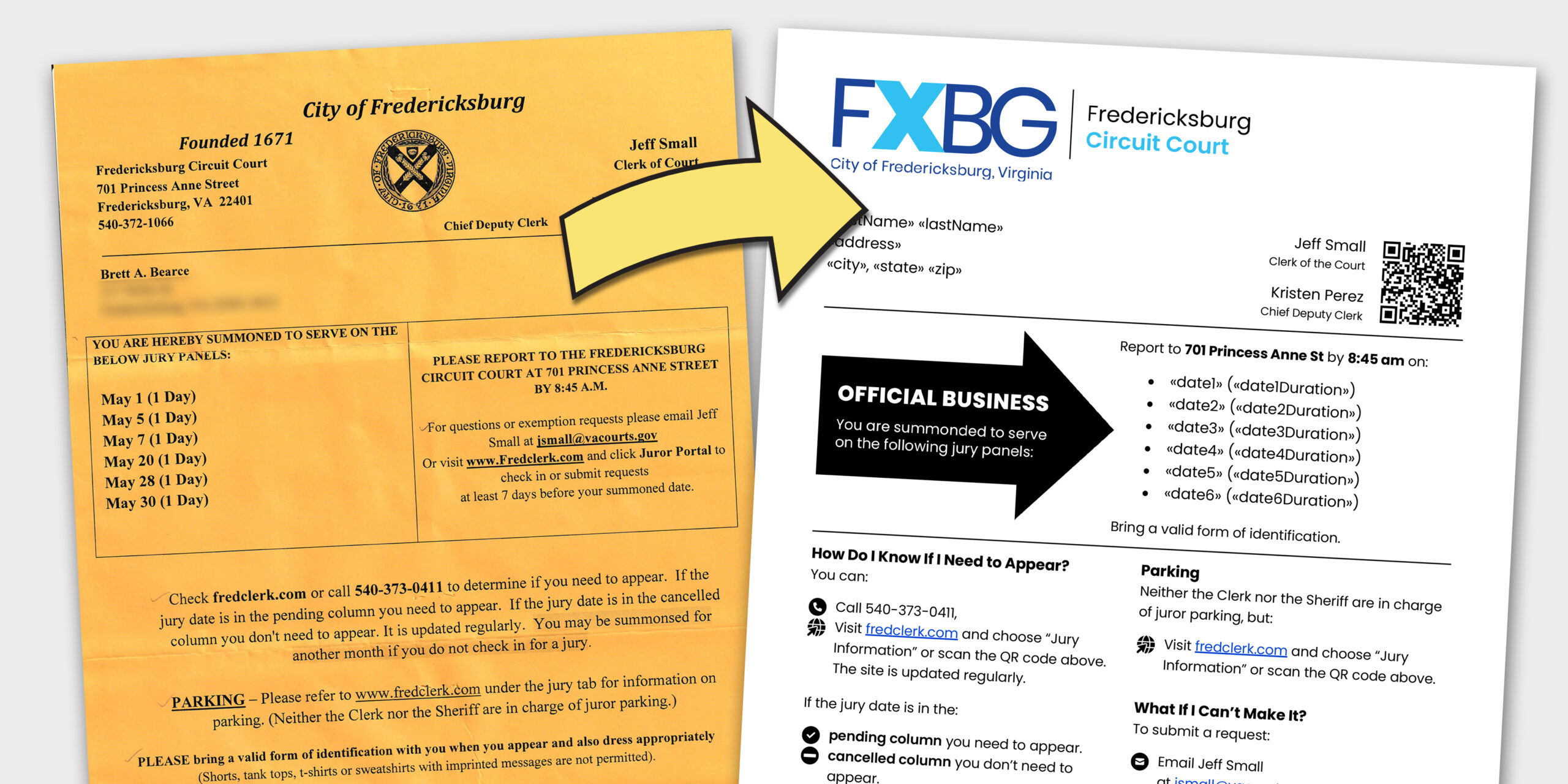
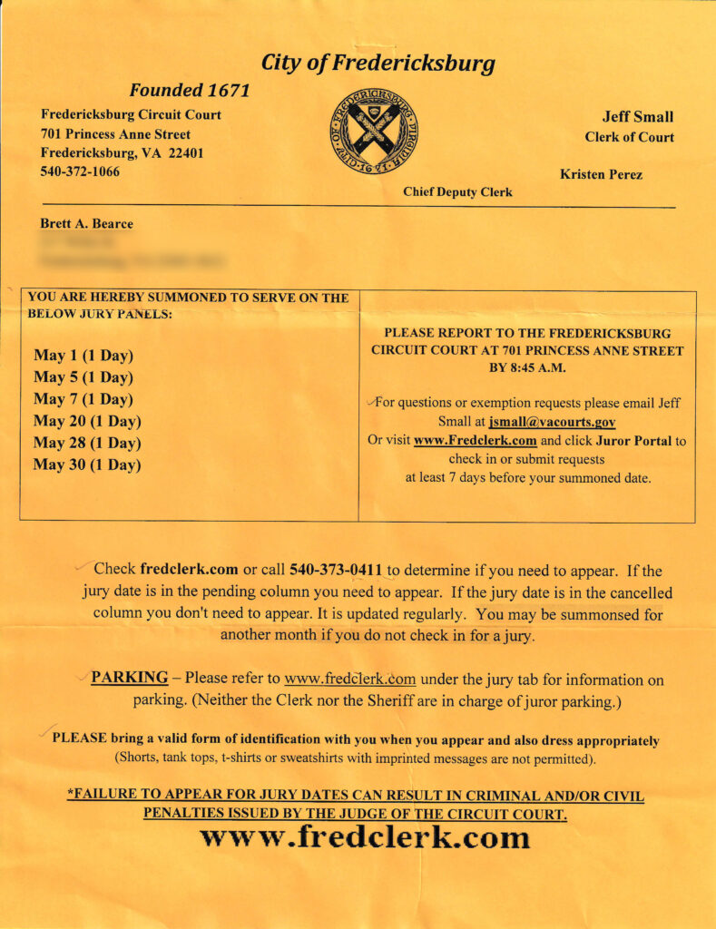
I recently received a summons to serve on a jury in Fredericksburg City (where I live). The document came printed on bright yellow paper and contains a significant amount of important information, but I felt like the way the information was organized could be more impactful and digestible with consistent use of typography and font weight to give the content more structure and readability.
Assumptions
As I considered how I would present this product differently, I made the following assumptions for the manufacturing of this product:
- It is produced in-house
- It is made in Microsoft Word, probably using its merge function with the datasource from a database
- Its final output is a printed document (versus a web page or PDF)
- Each sheet is hand-folded (which has to be a huge bummer for those who have to do it)
Opportunities
Things to address:
- Work to ensure it looks like an official communication
- Provide structure and organization to the content for improved readability and comprehension
- Create a data merge-ready Word document
- Make using the Word document easily repeatable without any new software or new processes
The Solution
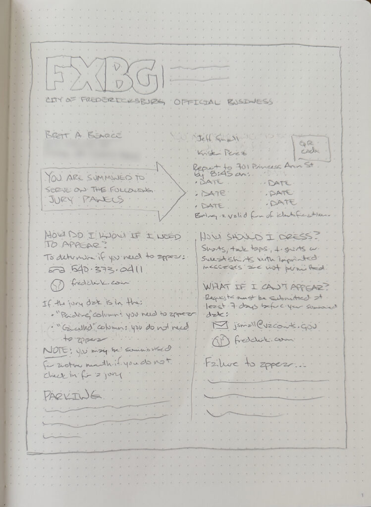
My process for just about every design project is to start by doodling ideas and hand-drawing a wireframe of the product. From there, I create the source file using the app I think will provide the greatest design flexibility for creating the final product. If any additional workflow is necessary to create a final product, I also work through that.
Aligning with the City’s Visual Identity
Recently Fredericksburg City adopted a new logo and visual identity. In recreating the summons, I decided to align the notice with that. The city posts its branding guidelines on its website, which is fantastic, so familiarizing myself with them was very easy.
Wireframe
After doodling and drawing for a while, here is the design I developed in a final hand-drawn wireframe.
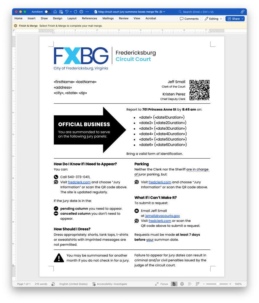
Creating the Source File
In most situations I would create a product like this in Adobe InDesign. It offers such detailed control of typography and object placement that it usually makes the most sense. In this situation, though, I wanted to create a usable product that would be easy to hand off to the city. And since I believe these documents are created using Microsoft Word with a data merge either from a database or an Excel file, I used Word.
Another thing I try to keep in mind is that the person using the product I create might have a different level of experience with Word, so I want to create a source document that feels comfortable to most. This includes, when I can, using the most common features and functions of an app.
In my first iteration of the Word doc, I tried formatting with columns and section breaks and that very quickly became messy and unwieldy. I was uncomfortable in the document and frustrated at how a minor formatting change or text change would throw off the entire layout. Instead, I decided to use hand-placed text boxes. I almost never take this approach as it makes creating an accessible document almost impossible, but since the final product is a printed sheet of paper, digital accessibility is not an issue.
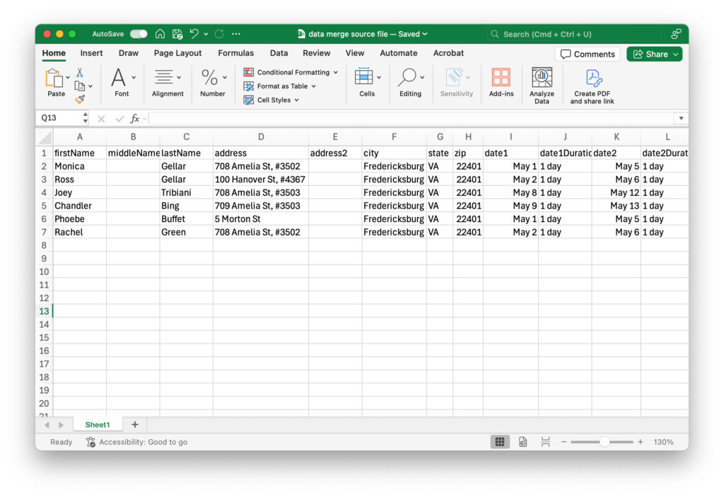
Creating a Dummy Data File
Whenever I need dummy data with names and addresses, I default to the Friends: Ross, Rachel, Monica, Chandler, Joey and Phoebe. This situation is no different, so I quickly created an Excel file to test the data merge and I gave them local addresses in downtown apartment buildings (except the apartment numbers are not real).
Final Product
After some testing and fine-tuning, here is a sample of the final product data merged. while this could be printed on yellow paper, I think using white paper makes just as much impact. Some other design notes:
- the document is divided into 3 sections: the official masthead, the dates and the details;
- the “official masthead” area uses the city’s logo which makes the document look official; it also includes a QR code that points to the webpage with all the detailed content on the city’s website;
- the “dates” area uses a large arrow to immediately focus the reader’s eye on the most important information: you have been summoned on these dates at this location and time; and
- the “details” area uses headings and iconography to give this important content more structure and to help the reader more quickly comprehend critical information.