Jobodex is a privacy-focused job search and organizer app designed to help people track opportunities, manage applications, create and manage resumes, and prepare for interviews.
The Challenge
Expand the design language of the newly-created Jobodex logo into a robust visual identity which will set the standards for all materials produced for Jobodex.
This project focused on:
- Color Systems
- Typography
- Logo and logo lockup
The Solution
Visual identity systems are typically expansive, clearly defining standards for business papers (like business cards and letterhead), digital media, marketing materials and more. Since Jobodex is an app, this project focused on establishing basic color systems and typography along with logo and logo lockup usage.
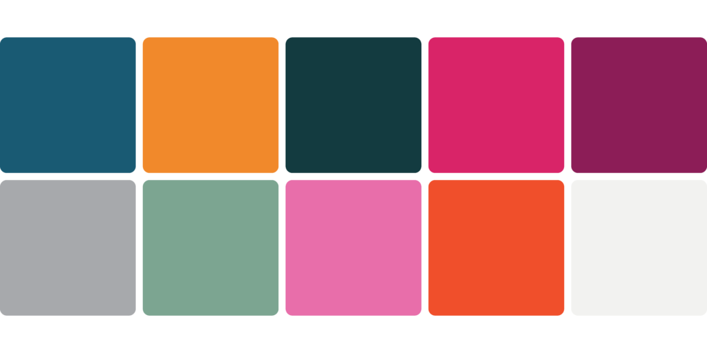
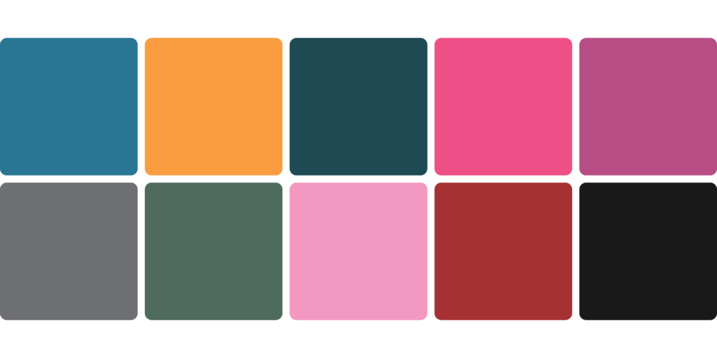
Color Systems
The Jobodex logo uses nine unique colors which created a great baseline and brand color system. With those established, the only thing left to do was to create:
- a default color system
- a dark color system for use in dark mode on the app and potentially the website
Default Color System
Default Dark Color System
Typography
Choosing the right type family for a brand is so important. Beyond color, typography sets the tone for how a brand is perceived. I also happen to love typography, so this part of creating a visual identity is always really fun for me.
Word Mark Type Family
With Jobodex, the typography needed to be simple and utilitarian but with a little flair that suggested something modern and yet established and stable. I knew immediately that I wanted to use Lubalin Graph for the Jobodex word mark. Created in 1974, its geometric character shapes answer the “simple and utilitarian” requirement. And its added “slabs” (the little bits and pieces that extend from each letter) provide that extra flair.
In looking at Lubalin Graph again I came across a type foundry that had redrawn it giving it a subtle and slightly updated interpretation and it was perfect: Lubalin Recast Serif by Dalton Maag type foundry.

Brand Type Families
In addition to Lubalin Recast, I also chose Mokoko (also Dalton Maag) and Archer Pro (Hoefler/Monotype).


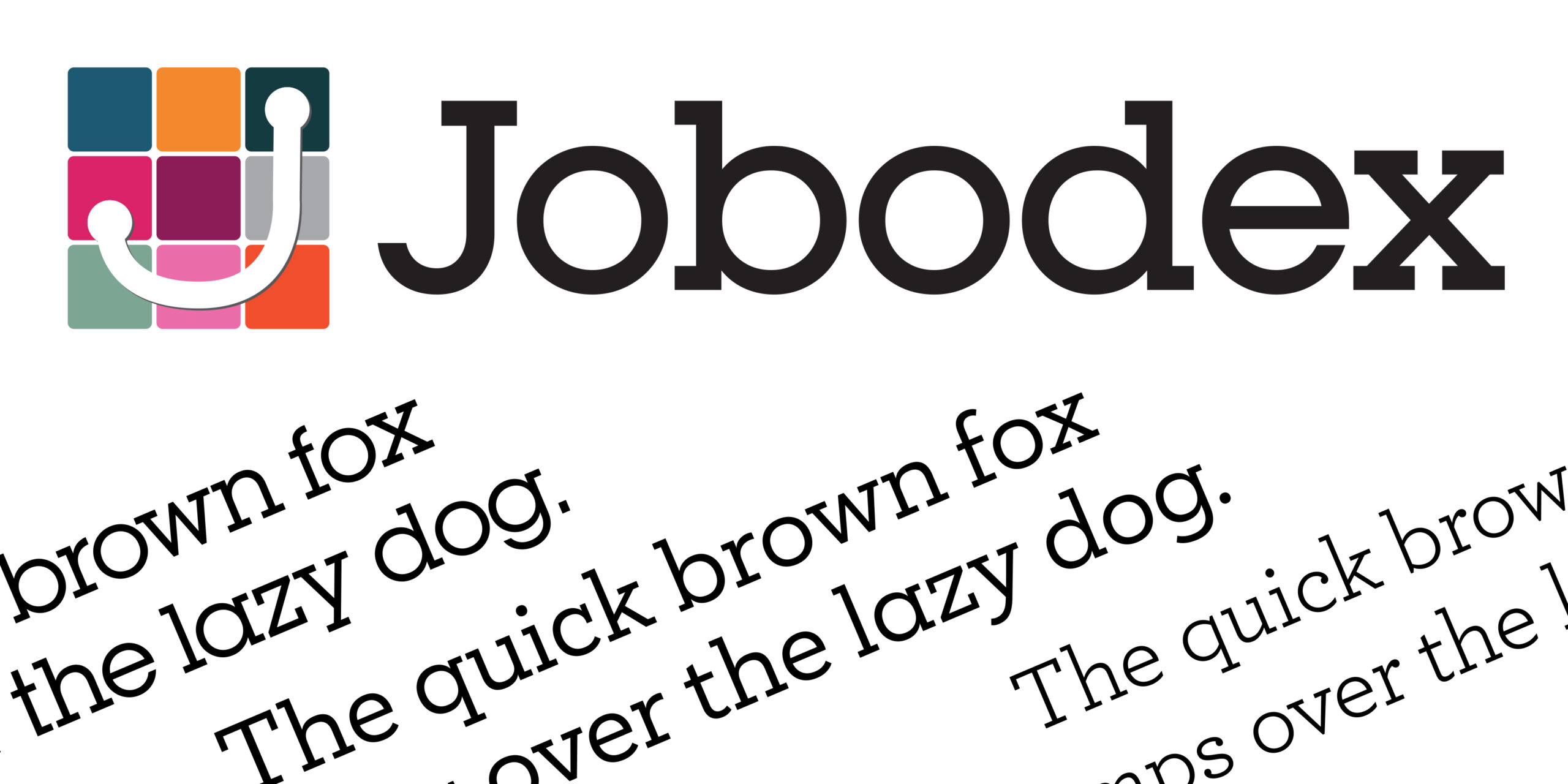
Logo and Logo Lockup
The logo was designed to represent the complexity, emotion, and progression of a job search into a single, distinctive mark. A grid of multicolored cards represents the many elements of the process—applications, resumes, events, and tasks—while a continuous path forms a subtle “J,” illustrating the journey from uncertainty to success. The logo translates very well into both an app icon and a social avatar.