MCC’s 20th Anniversary Logo
September 2023
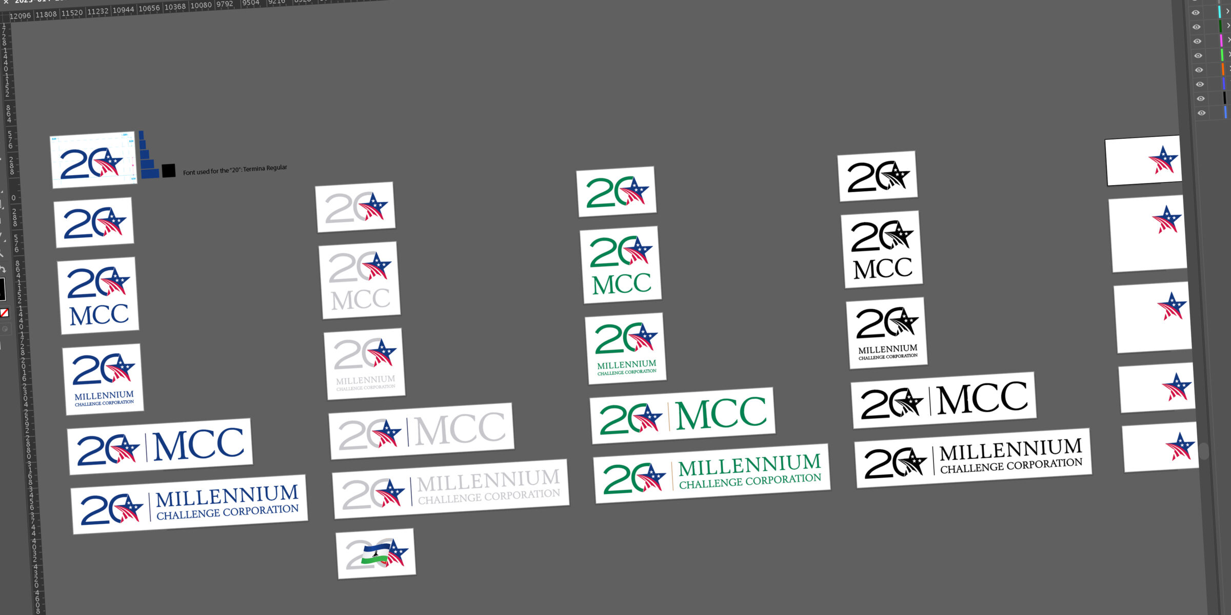
MCC celebrated its 20th anniversary in 2024 and to mark the occasion, MCC created a sub-brand to differentiate its products during that celebratory year. The sub-brand included this logo, a dynamic tagline, and a unique color palette.
The Challenge
Create a mark that:
- Could stand on its own and be recognizable as MCC
- Be simple and elegant
- Highlight MCC’s 20th anniversary
- Reproduce well at just about any size
- Be adaptable to both the 20th anniversary color palette and the agency’s standard color palette
The Solution
MCC’s Creative Services team, of which I was the director, brainstormed and worked collaboratively to develop three unique designs based on the same principles:
- Make it extremely simple
- Use the MCC Star, the most recognizable symbol of MCC
- Use “20”
The resulting logo included just those two elements combined together in a way that had the star as the dominant element and the “20” peeking out behind it. This was the first time the team decided to use a typeface other than its standard corporate fonts.
Final Product


Organization
MCC
