The Perfect User Interface Sketch Pad
September 26, 2019
I sat down at my laptop, staring at the screen trying to develop a look-and-feel concept for both the new brettro.com and my personal website. I launched Photoshop, mucked around with a grid and started creating some shapes, but it felt too premature to be already designing on the computer.
Sketching with Pencil and Paper
I love the feel of pencil and paper to seed ideas. It’s easy to start and stop, to draw and erase, to crumple up, toss and start over. It just feels more natural, more connected. Working in Photoshop makes everything feel more finished, like an idea is fully cooked. Plus I got bogged down in thinking about what framework (if any) I wanted to use and whether I should set up my Photoshop file using a framework template. I ended up going down a rabbit hole of decisions that didn’t need to be made at the point of ideation. (And, tangentially, I’ve been paying attention to Adobe’s new UX design and development tool called XD.) Everything about starting in Photoshop felt awkward.
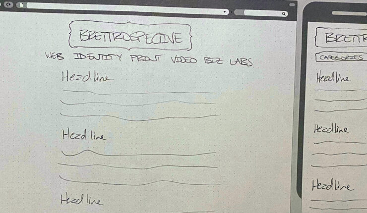
So I pulled out a sheet of paper and started sketching. But developing design ideas for websites now requires thinking through how your concept would look on multiple devices. Drawing and re-drawing a desktop area and a tablet area and a smartphone area on a sheet of paper interrupted my creative flow.
“There has to be a sketchpad for user interface ideation,” I thought.
Finding a Sketch Pad
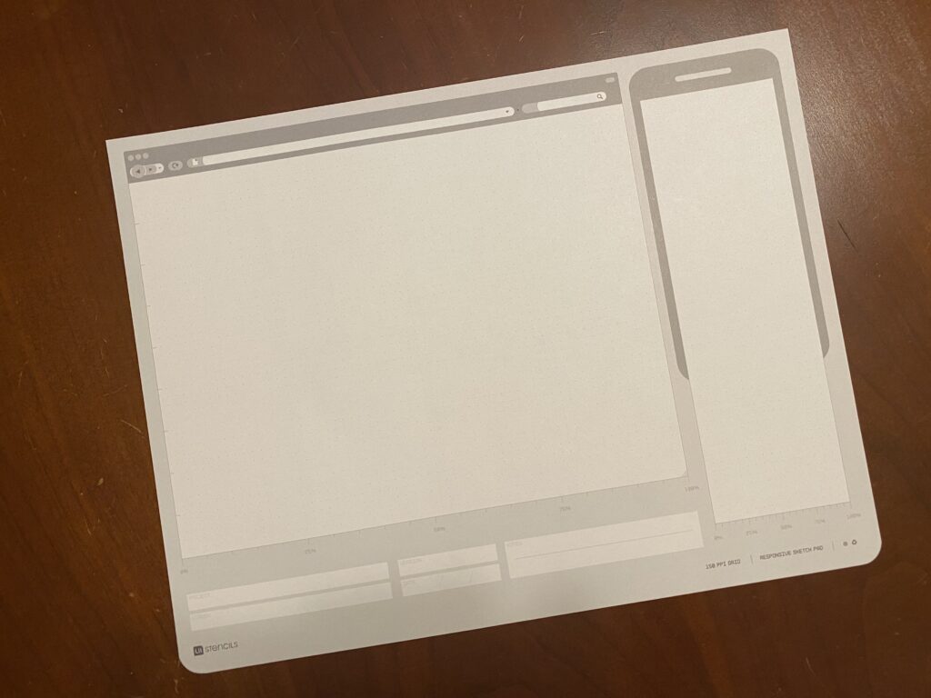
I put down my pencil, picked up my iPad and started surfing, ultimately finding UI Stencils’ Responsive Sketch Pad. The pad is ideal. On one side it has a large browser window and a smartphone window with boxes for project name, screen, version, date and notes.
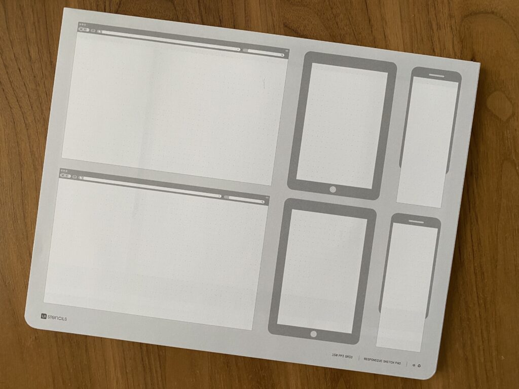
The other side has two browser windows, two tablet windows and two smartphone windows.
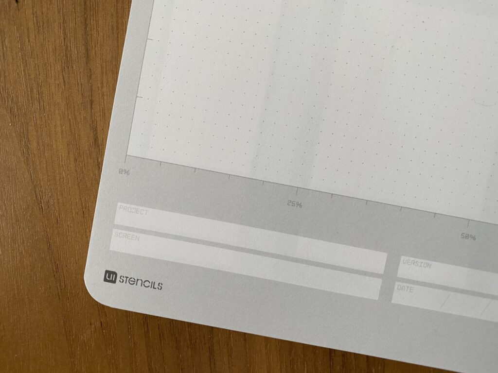
Every window has very subtle dots in them affording you the opportunity to work on a grid, if you’d like. And the windows on the front side include hash marks for percentage widths on both windows.
Using the Sketch Pad
Using the pad is great! The paper is high quality and a little heavier than normal printer paper which makes it rugged enough to handle multiple pencil erasures while still keeping its integrity and looking good. I find the window size on the template to be very functional for getting ideas down, even if I can’t capture the entire vertical page in one template.
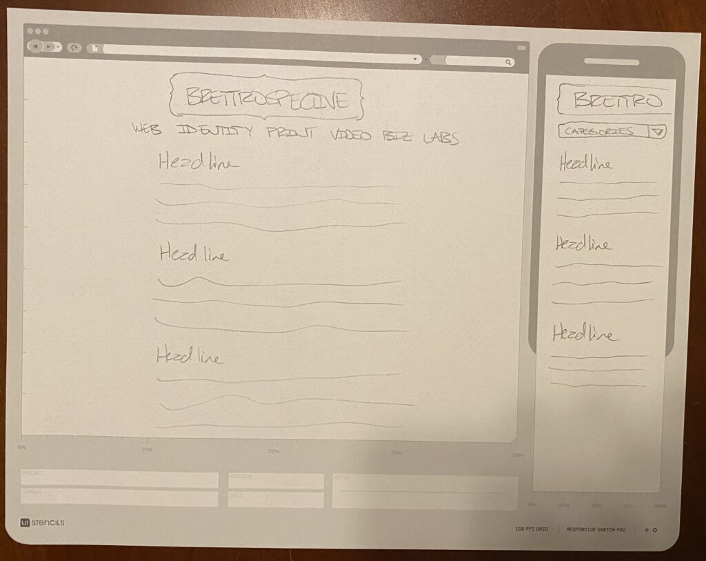
I’m looking forward to having this pad around as I start to doodle and pull together my ideas about how brettro.com should look.
