Brettro Design System: Containers & Layouts
May 9, 2025
As I continue to wrestle with my baseline grid and type scale, I tackled containers and layouts as part of my design system journey.
Containers
For my design system, containers are the areas of a page to position the layout grid within them.
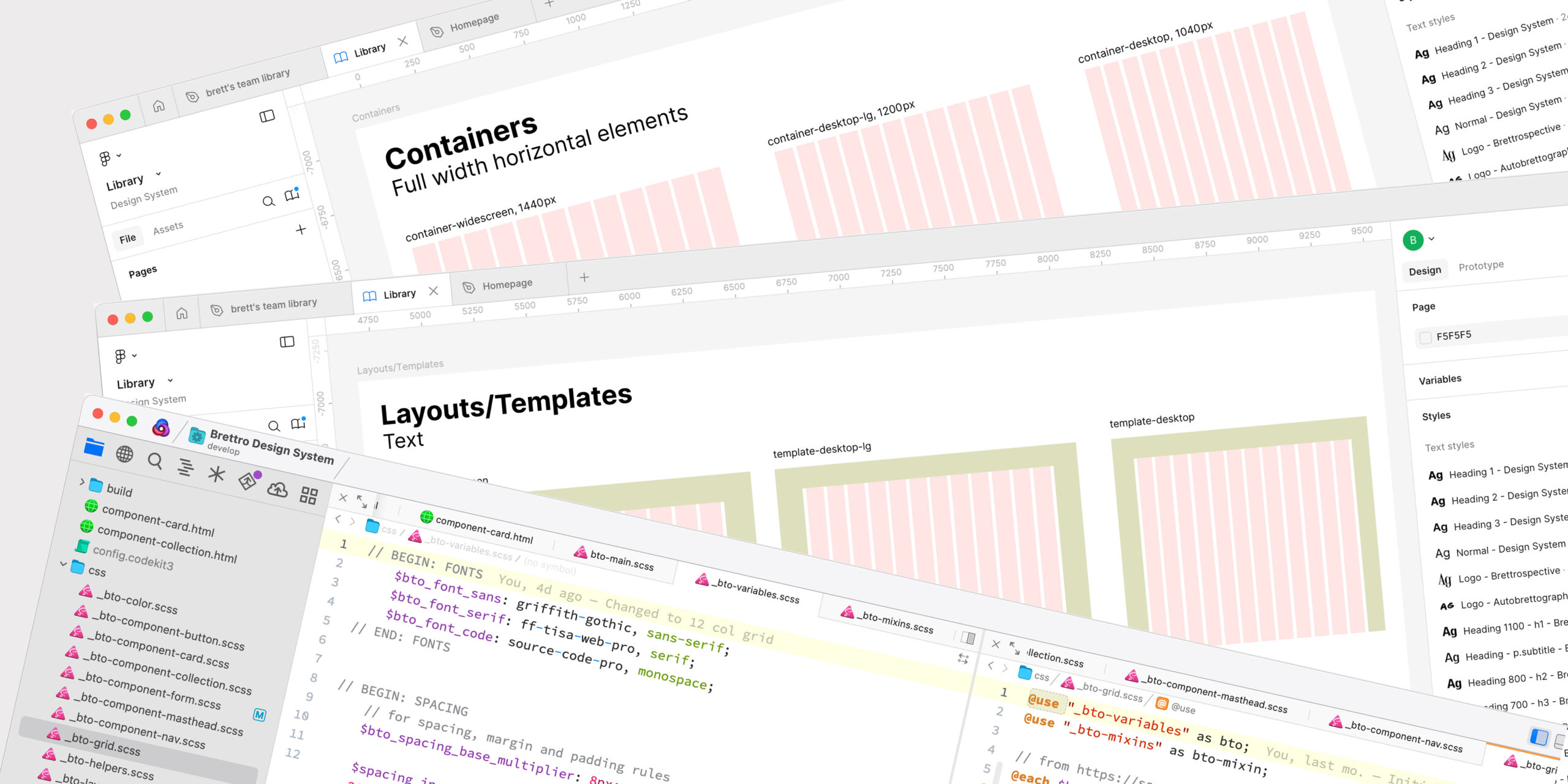
Page Containers
Page containers serve as the breakpoints in the system’s responsive design. the labels I chose for my page containers are adopted from the U.S. Web Design System (USWDS). I recently migrated a website using the USWDS, so their terminology is already familiar to me and I think the entire design system is incredibly detailed, customizable and well thought out. My page containers use a 12 column grid like the USWDS.
The 16 Column Conundrum
Originally I used a 16 column grid because I had used one years ago on a site and I remember it working well. I also liked that it was divisible by my base multiplier 8, which somehow felt tidy. The practicality—or lack thereof—of a 16 column grid quickly revealed itself as I began creating layouts using cards. The number 16 is not divisible by three without a remainder, making cards at certain breakpoints too skinny and generally unsightly. After several days of trying to convince myself that the 16 column grid was, in fact, fine and a solid decision, I finally came to the more correct conclusion and switched to 12.
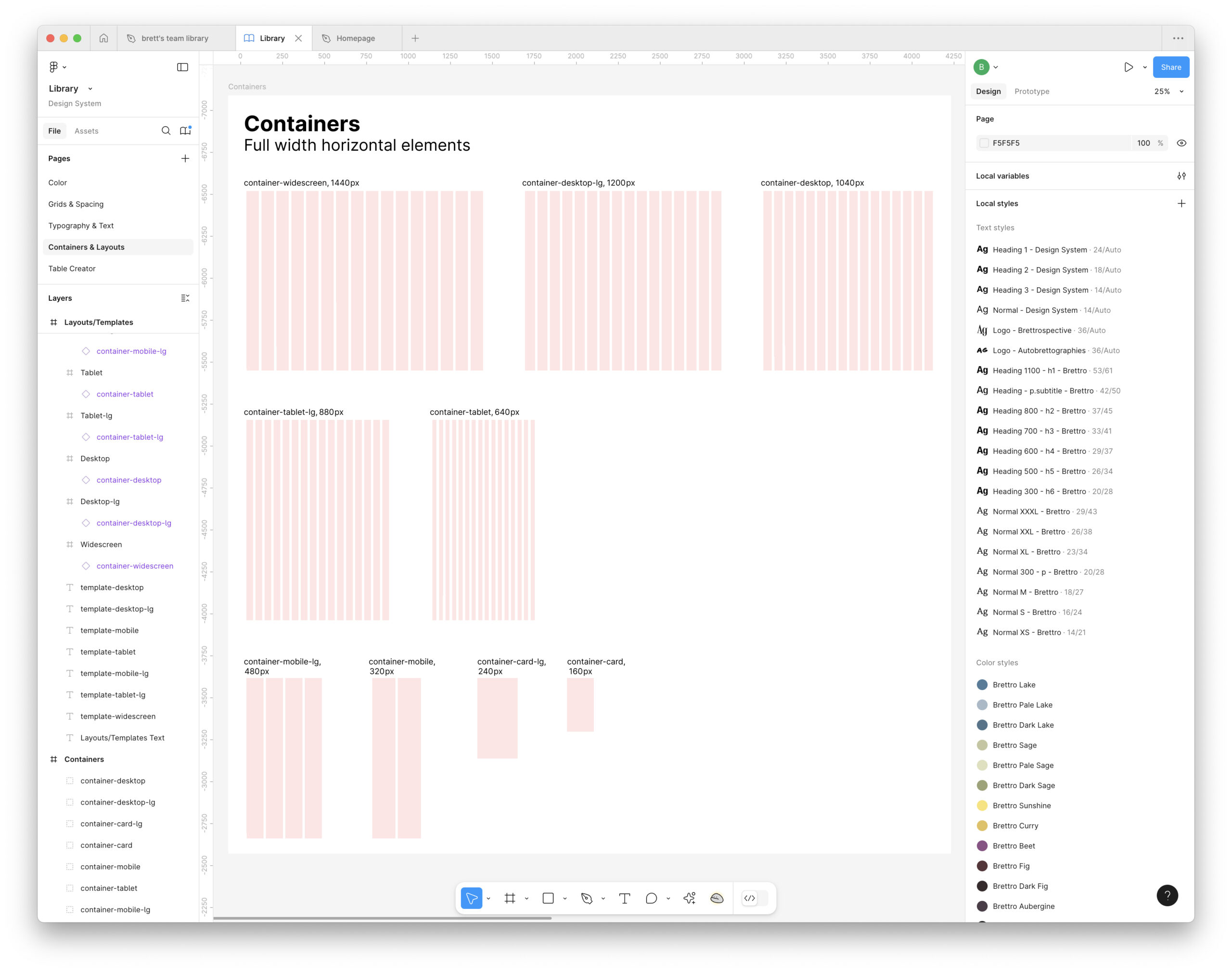
Container Breakpoints
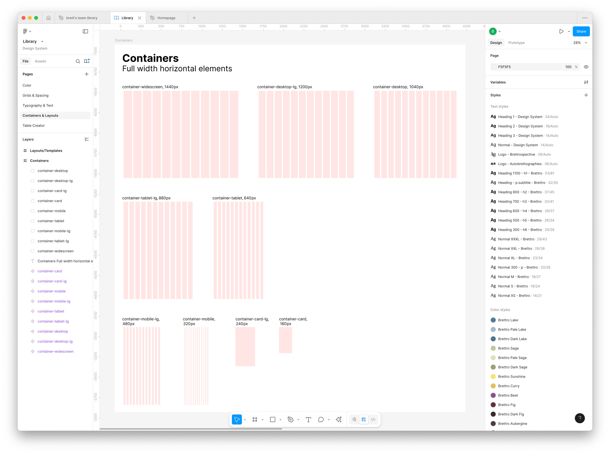
The container breakpoints are:
- card: 160px
- card-lg: 240px
- mobile: 320px
- mobile-lg: 480px
- tablet: 640px
- tablet-lg: 880 px
- desktop: 1040px
- desktop-lg: 1200px
- widescreen: 1440px
These page container widths are all multiples of 8, my base multiplier.
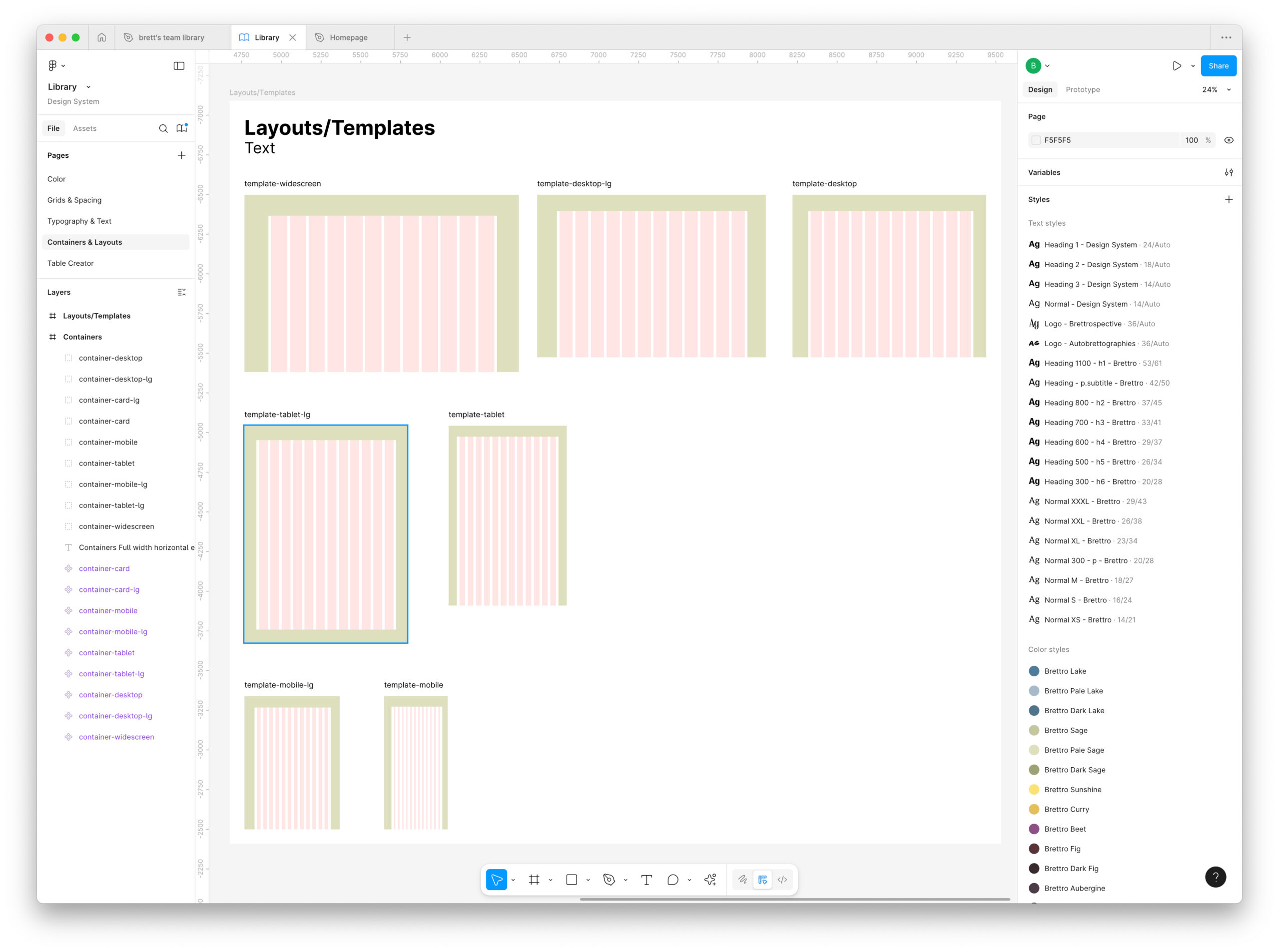
Layout Grid
I whipped up the page containers pretty quickly and then created baseline layouts for each breakpoint based on that. After doing so, I sat back and thought, “well that was easy, what am I missing?”
I thought about it. And I stared at my Figma window. And I thought about it more. And then I decided to start coding the layout grid for the page containers. And that’s when I found the complexity.
I set up several SASS files and created a baseline (and rough) template to test my work. Those files are (the “bto” in the filenames is the namespace for Brettro):
- _bto-reset.scss: a basic reset of all predefined browser CSS styles;
- _bto-variables.scss: font, color, grid, etc. variables to be used throughout the stylesheet;
- _bto-grid.scss: layout grid styles, including classes for column width, spacing, margin, padding, borders and offsets;
- _bto-layout.scss: page container styles based on breakpoint;
- _bto-typography.scss: styling for HTML text elements and additional classes for styling text; and
- bto-main.scss: the file where all the SASS files are combined and compressed.
Right now my SASS file structure feels a little messy, confusing and not well organized, but I also feel like this helped me move forward, so for now I will keep it as-is but continue to give some thought to the individual SASS files and their purposes as I continue to build out the design system. I suspect I will rename the _bto-grid.scss file or consolidate it with the _bto-layout.scss file. The two seem so tightly related but they also do different things.
SASS-y Code
It had been a minute since I had written SASS code from scratch. It was fun to dust off those cobwebs, haul out one of my favorite reference manuals and start writing.
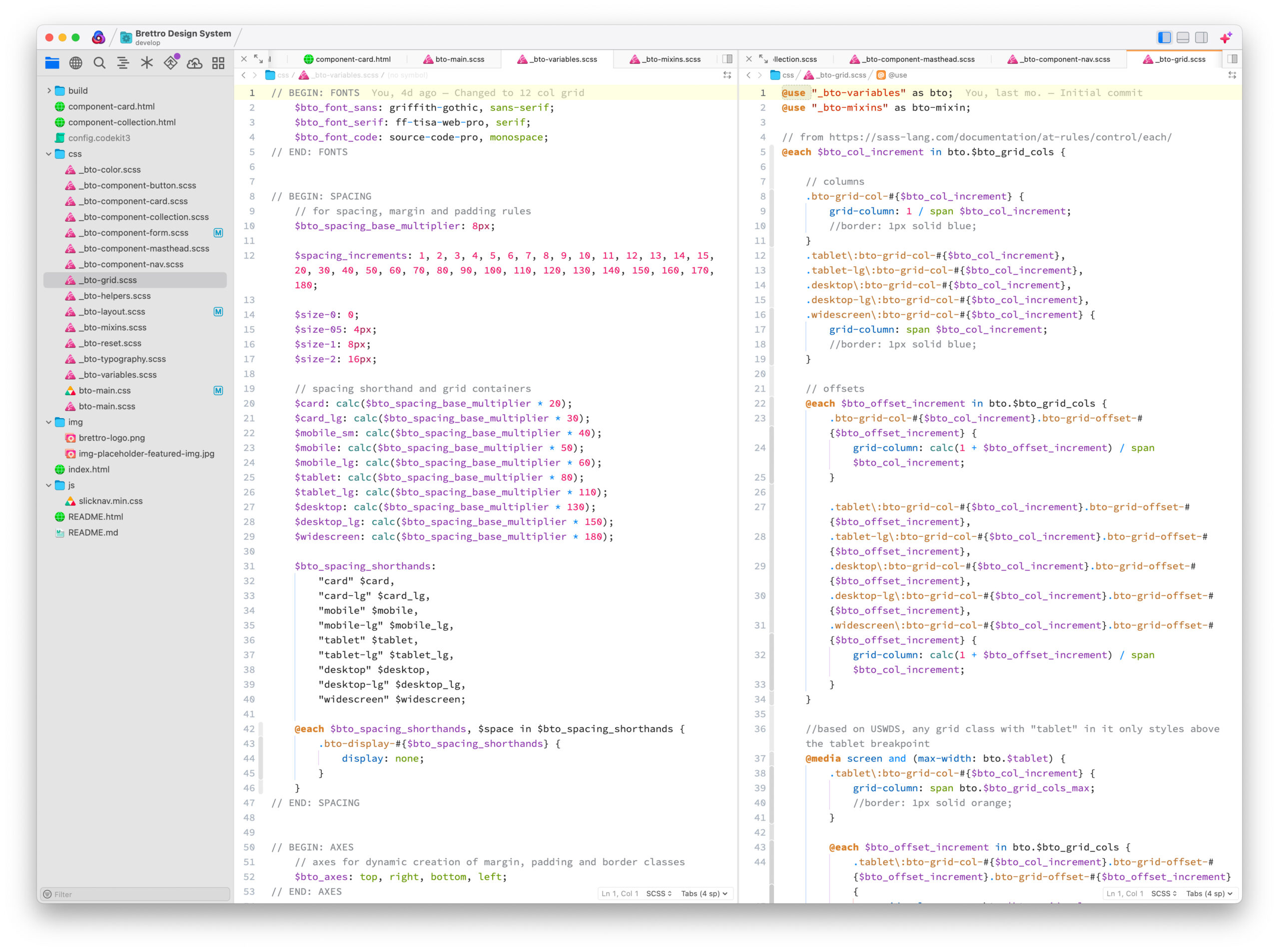
I’m particularly pleased with the code that creates the column, spacing, margin, padding and offset classes:
Columns and Offsets
The $grid_cols variable is a series of numbers starting at 1 and ending at 12 and is set in the _bto-variables.scss file. The border attribute will be removed in the production version. I set it so I could confirm that that column classes rendered correctly.
@each $col_increment in bto.$grid_cols {

	// columns
	.bto-grid-col-#{$col_increment} {
		grid-column: 1 / span $col_increment;
		border: 1px solid blue;
	}

	// offsets
	@each $offset_increment in bto.$grid_cols {
		.bto-grid-col-#{$col_increment}.bto-grid-offset-#{$offset_increment} {
			grid-column: calc(1 + $offset_increment) / span $col_increment;
		}
	}
}
Spacing, Margin, Padding and Borders
The $spacing_increments variable is also a series of number that match the spacing increments defined in the design system and is also set in the _bto-variables.scss file. Defining this variable made it very easy to create these classes in a very DRY (don’t repeat yourself) way.
I also defined an $axes variable with “top, right, bottom, left” so that I could create margin, padding and border classes for each axis.
// spacing classes
@each $space_increment in bto.$spacing_increments {
	.bto-space-width-#{$space_increment} {
		width: calc(bto.$bto_spacing_base_multiplier * $space_increment);
	}
	.bto-space-height-#{$space_increment} {
		height: calc(bto.$bto_spacing_base_multiplier * $space_increment);
	}

	// margins
	.bto-margin-#{$space_increment} {
		margin: calc(bto.$bto_spacing_base_multiplier * $space_increment);
	}

	@each $axis in bto.$axes {
		.bto-margin-#{$axis}-#{$space_increment} {
			margin-#{$axis}: calc(bto.$bto_spacing_base_multiplier * $space_increment);
		}
	}

	// paddings
	.bto-padding-#{$space_increment} {
		padding: calc(bto.$bto_spacing_base_multiplier * $space_increment);
	}

	@each $axis in bto.$axes {
		.bto-padding-#{$axis}-#{$space_increment} {
			padding-#{$axis}: calc(bto.$bto_spacing_base_multiplier * $space_increment);
		}
	}

	// borders
	.bto-border-#{$space_increment} {
		border: calc(bto.$bto_spacing_base_multiplier * $space_increment)solid #222222;
	}

	@each $axis in bto.$axes {
		.bto-border-#{$axis}-#{$space_increment} {
			padding-#{$axis}: calc(bto.$bto_spacing_base_multiplier * $space_increment) solid #222222;
		}
	}
}
Layouts
Layouts are the actual page templates that combine components to create the web pages or app screen. It feels preliminary to dive deeply into creating the templates at this stage. I still need to create the design system’s components in order to create the pages. At this point, though, I can:
- Create initial template pages in Figma, and
- Identify what template types I will need as part of the WordPress theme I am developing for this website.
Initial Template Pages
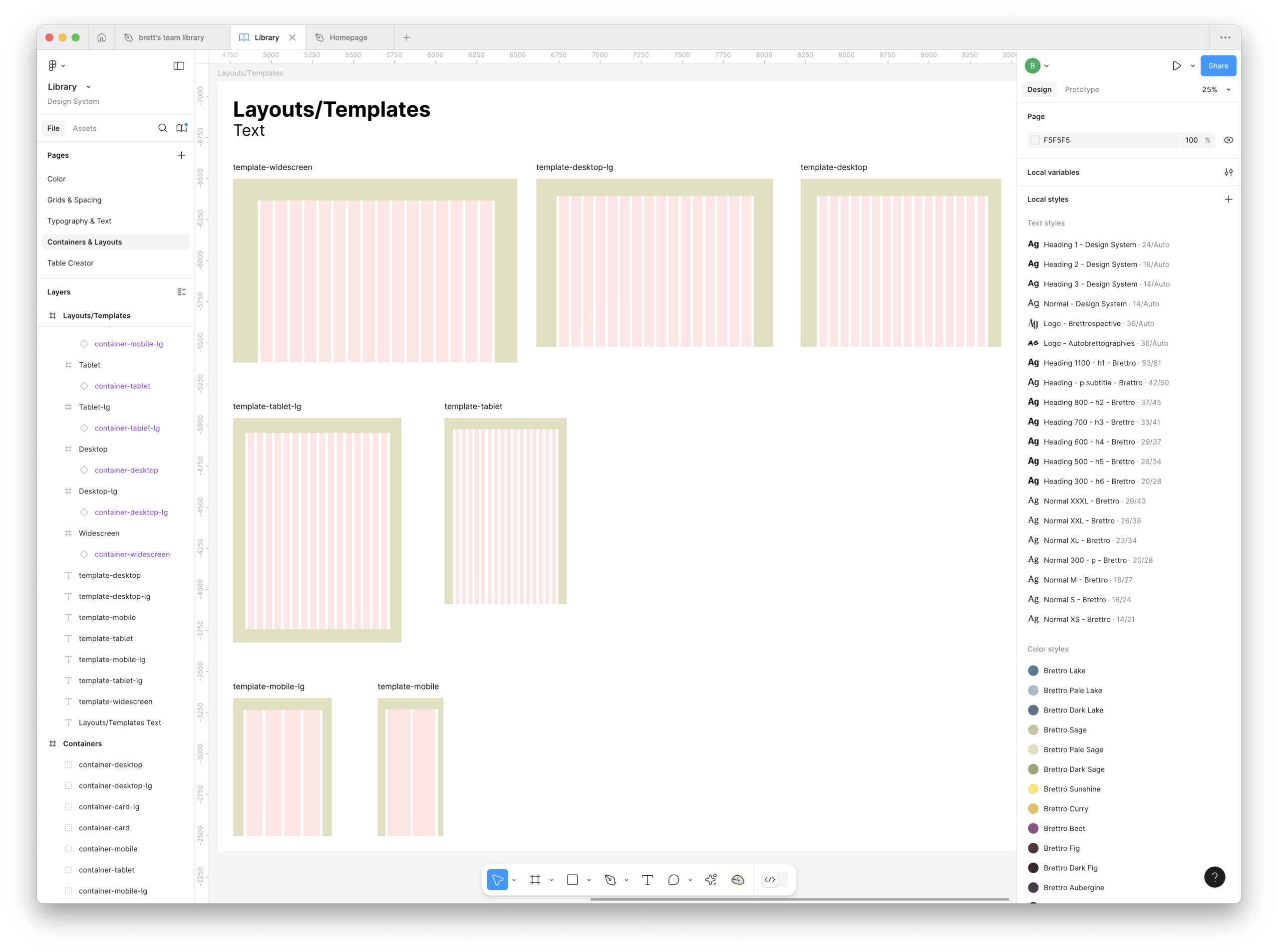
I created these initial template designs for each breakpoint. It’s a small start, but it’s a start!
WordPress Theme Templates
According to WordPress’s Theme Handbook, the section on templates says that only an index.html template is required for a block theme, but many themes also include these:
- 404.html
- archive.html
- author.html
- home.html
- page.html
- singular.html
These additional templates give a WordPress theme a bit more polish and flexibility, so I will be making all seven templates when I begin my theme development.
What’s Next?
I have three areas of focus over the next few weeks:
- Continuing to figure out how typography’s baseline grid reconciles with my type scale,
- Beginning to design components for the system (like cards, collections, header, etc.), and
- Color.
if you’ve made it this far, do you have any advice?