Brettro Design System: Typography, Part 1
December 5, 2024
Well…it’s been a minute since I have focused on the Brettro Design System. Life has a funny way of pulling your focus from things, but I am re-focused on my continued learning about design systems and creating the Brettro Design System, so let’s keep going.
This entry’s focus is on typography for design systems. I love typography, like love it. Fonts are exciting to me with each type family’s nuances and how the choice of a typeface or typefaces can set the entire tone and mood of a product. That, to me, is just remarkable.
Old Decisions
I had done quite a bit of work on the Brettro Design System typography way back in 2020 when I first started tackling this project. I had:
- Selected my type faces, which at the time were Bureau Grot and Tisa Pro (my constraint was that they must be available on Adobe Fonts);
- Established my typography components using Adobe Spectrum’s structure as my guide;
- Determined my type scale and multipliers; and
- Determined my space interval names.
I had even created a very detailed Excel spreadsheet to manage and calculate the typography scales.
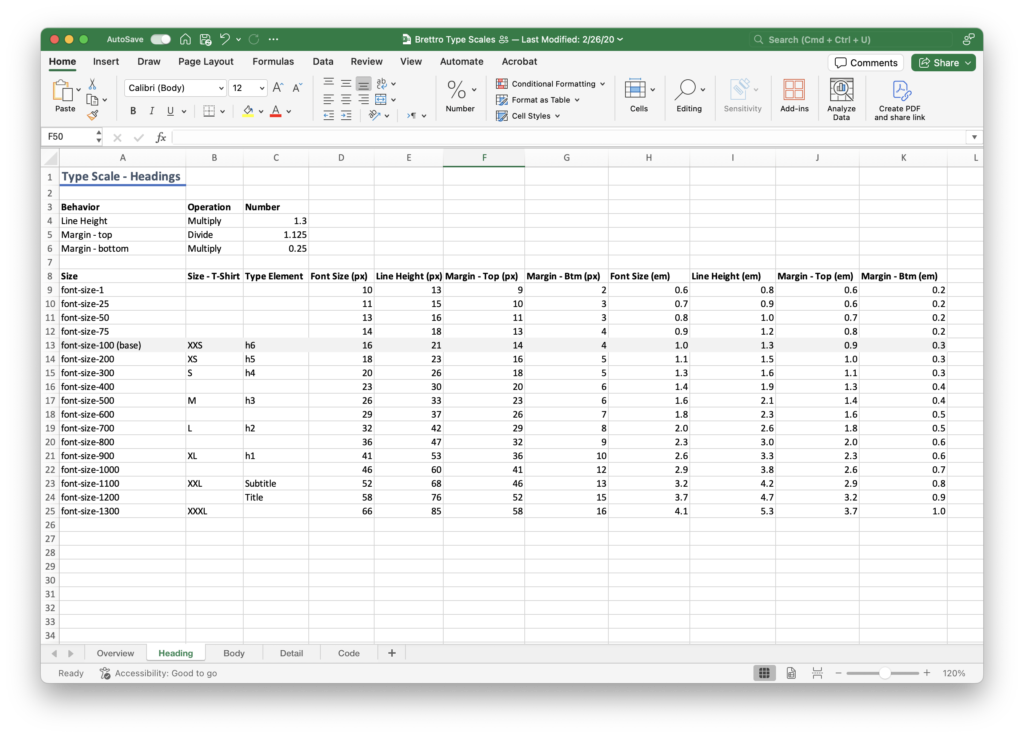
I chose 1.125 as my type scale, which is Adobe’s Spectrum scale to help me get started while I learned more about design systems. After reviewing my Grids & Spacing entry, it was clear I made that decision prior to writing it.
New Decisions
After reviewing my notes, reviewing the entries I had written about design systems, moved my Typography & Text content from XD to Figma, and dusted off the four books I had used as my guide, I realized I needed to make some new decisions about typography. They are:
- Typefaces: Bureau Grot was no longer available on Adobe Type, so I chose Griffith Gothic. It works well with Tisa Pro.
- Typography components: these stayed the same, they are logo, heading, body, detail and code.
- Type scale: this was the hardest change to make. I had done a significant amount of work on my multiplier and scaling, but the work did not seem to align with the base number for my spacing system, which is 8.
- Space interval names: I had settled on t-shirt sizing (s, m, l, xl, etc.), but after reading my Grids & Spacing entry, my decision there was to use digits, so I changed to digits.
Type Scale: A Deep Dive
Building Design Systems says that your system’s type scale needs to align to your system’s baseline grid, which is a horizontal grid that brings structure to a page. The baseline grid needs to be based on your spacing system base number. Expressive Design Systems says that type scales are usually based on musical interval ratios (which I find fascinating). And Smashing Magazine says that your baseline grid should be the same as your line-height for your body text. There is a lot to unpack here.
After several hours of trial and error (and holding my head in my hands in frustration), here is where I landed:
- Type scale: keep 1.125, which is “major second” on the musical interval ratios; and
- Baseline grid: 8px to match my spacing baseline and because it is a multiple of my body text line-height, which is 24.
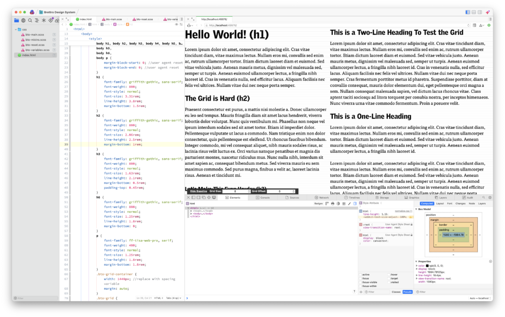
For the moment, I am calling these interim decisions. I spent quite a bit of (very frustrating) time trying to get my baseline grid and type scale to work out so that in a multi-column layout the text blocks are correctly balanced. Everything I have read says this is hard. I can say with confidence that it is. And my work here isn’t done. But I want to keep moving forward, so for now, these are my decisions.
Where Do We Go From Here?
Not being able to get the type scale and baseline grid completely sorted out has been frustrating, so I will keep at it until I crack it. I am also moving forward with:
- the beginning of my color system,
- containers and layouts, and
- creating a list of components to make (and starting to make them).