Exporting InDesign to HTML: Images

Tl;dr: skip to Putting It All Together to read the conclusion without having to read the adventure it took to get there.

Overview

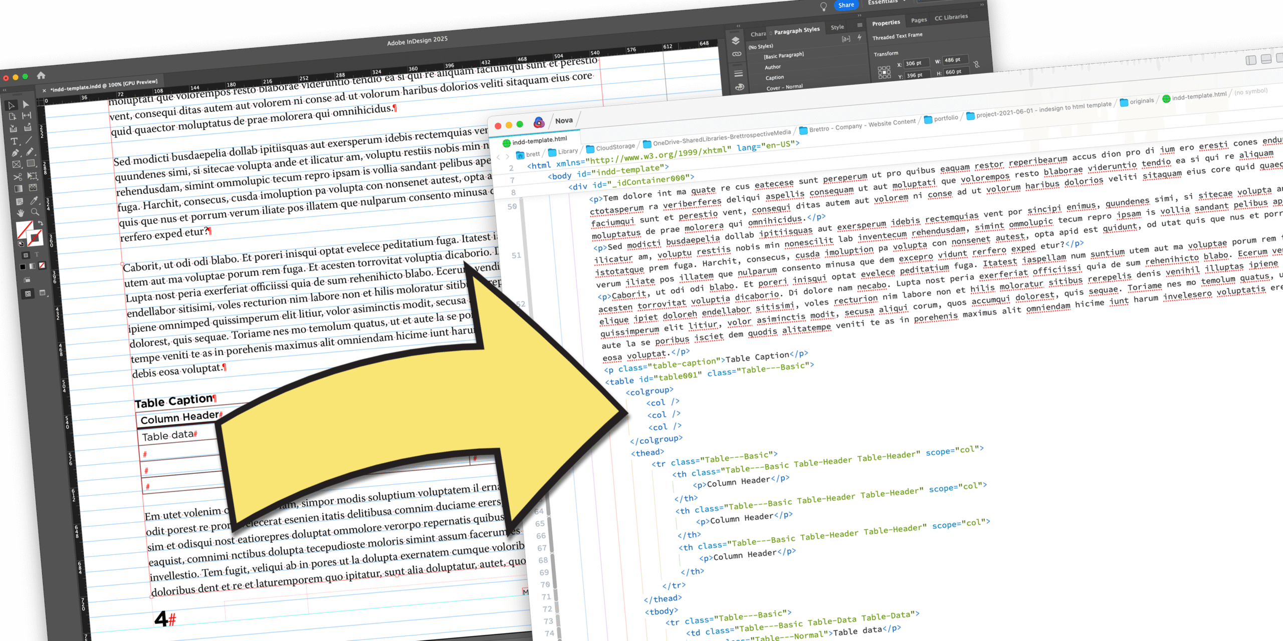
This is part 3 of a multi-part series where I do a deep dive into Adobe InDesign’s export to HTML functionality, with this post’s focus on images.

Part 1, Exporting InDesign to HTML: The Basics took a look at exporting basic document elements: title, headers, text (including bolded and italicized text), bulleted lists and numbered lists.

Part 2, Exporting InDesign to HTML: Tables took a look at the steps necessary to export semantically correct tables from InDesign to HTML.

Background

I much prefer posting long-form documents to the web as HTML. It’s not that I dislike PDFs, but experiencing a PDF on a smartphone and, sometimes, on a tablet is irritating. But creating a PDF is much faster than marking up a long document in HTML.

Enter Adobe InDesign, a document production app most often associated with print documents (and PDFs). But in the past few years Adobe has worked to make it viable in the digital publishing space. And one aspect of that is the ability to export a document to HTML.

That functionality intrigues me because the potential efficiencies created by a fully-featured, well-executed export function are measurable. So I decided to do a deep dive into this with three questions framing my assessment:

  • How semantic and clean is the markup on export?
  • How does a complex document export to HTML?
  • How robust are the options when exporting to HTML?

The Approach

I want to continue being methodical about this, so that as I found pitfalls in the process I would be able to know where to fix things and adjust along the way.

My approach:

  1. In a change from my previous posts, I did not update the source Word document. In my experience, images (or other vector or raster graphics) are usually independent files placed in InDesign;
  2. Identify often-used elements, like a photo caption and a photo credit, to ensure that images needing those elements export correctly;
  3. Use the standard paragraph and character styles found in Word, if possible, to be consistent across apps and, if not possible, create the necessary new ones; and
  4. Iteratively add complexity once I met with success doing the simple markup export and successes with each level of complexity added.

Often-Used Elements with Images

In many instances, a placed graphic will need a caption or a credit of some kind. And in those instances in HTML, the following things need to happen:

  • The <img> tag should be wrapped in the <figure> tag;
    • Solution: Create paragraph style called Figure, assign <figure> tag to export tag
  • The <img> tag’s alt parameter needs to have content added;
    • Solution: select the image, right-click, then choose Object Export Options…
  • The image caption and/or credit needs to be wrapped in the <figcaption> tag;
    • Solution:
      • create an object style called Image Figcaption;
      • Assign <figcaption> to the Export Tagging and assign it to the text box containing both the caption and the credit (both of which have their own paragraph styles;

Export Attempts

It took me 28 export attempts spread across several hours over the course of several days before I finally had the HTML exporting correctly. Rather than detail each of those attempts, I’m just going to go directly to the solution.

Putting It All Together

This is a multi-step process involving creating paragraph styles, object styles, text and image frames and grouping them all together. Once one is created, though, it can be added to an Adobe CC Library so that it’s easily available whenever it’s needed.

Create New Paragraph Styles

  • Caption: create a new paragraph style named Caption and in the “Export Tagging” option assign:
    • Tag: p
    • Include Classes in HTML: checked
    • Class: caption
  • Credit: create a new paragraph style named Credit and in the “Export Tagging” option assign:
    • Tag: p
    • Include Classes in HTML: checked
    • Class: credit
  • Figure: you’ll never actually assign this style to anything, but one of the Object Styles you’ll create below does; it’s necessary for spacing. Create a new paragraph style named Figure and in the “Export Tagging” option assign:
    • Tag: figure

Create the Object Styles

Ended up creating three object styles: one called Figure, one called Image Normal and one called Image Figcaption. Combined together, these three object styles successfully create almost semantically correct HTML output.

  • Create the Figure object style :
    • Anchored Object Options:
      • Position: choose Inline or Above Line
      • Select Above Line
        • Alignment: left
          • Space before: 0
          • Space after: 0
    • Export tagging:
      • Tag: enter figure
  • Create Image Normal object style
    • Basic Attributes
      • Paragraph style: assign Figure
      • Text Wrap: off
      • Anchored Object Options:
        • Position: choose Inline or Above Line
        • Select Above Line
          • Alignment: left
          • Space before: 0
          • Space after: 15
      • Export Tagging: leave set to [automatic]
    • Export Options > Alt Text choose Custom from “Alt Text Source” menu
  • Create the Image Figcaption object style
    • Basic Attributes
      • Anchored Object Options:
        • Position: choose Custom
        • Anchored Object Reference Point: choose the upper, left-hand square in the grid
        • Anchored Position Reference Point: choose the middle, left-hand square in the grid with:
          • X Relative To: choose Text Frame with X Offset at 0
          • Y Relative To: choose Baseline with Y Offset at 0
      • Export Tagging:
        • Tag: enter figcaption

Create a Group of Text and Image Frames and Assign Object Styles

These three object styles need to be combined together to create one object that will export to semantically correct HTML for images with captions and/or credits.

  1. Create a frame and assign it the Figure object style. Make sure the frame is wide enough to stretch from the left to right margin of your document and tall enough to take up about half a page.
  2. Create another frame and assign it the Image Normal object style. (It helps to place an image in the frame.)
  3. Create a third frame and assign it the Image Figcaption object style. In that frame insert the following text:
    1. Photo credit and assign it the Credit paragraph style
    2. Caption and assign it the Caption paragraph style
  4. Select the Image Normal frame and cut and paste it into the Figure frame.
  5. Select the Image Figcaption frame and cut and paste it into the Figure frame below the Image Normal frame

Add it to Your CC Library

Add this new group of frames to your “Presos, Proposals and Pubs” CC library so you can easily insert this into documents later.

  1. Select the Figure frame
  2. From the CC Library palette click the + button and choose Graphic.

Inserting a Figure

Insert the Figure text frame inline wherever you need an image placed.

Exporting to HTML

On my 28th—and first successful—export attempt, I used the following settings.

Export Screen

To export to HTML:

  1. Choose Export… from the File menu
  2. In the “Export” window:
    1. Enter a filename in the “Save As” field (it is pre-populated with the name of your InDesign file)
    2. Choose HTML from the “Format” dropdown menu
    3. Click Save
  3. In the “HTML Export Options” window:
    1. General: I left everything as-is
    2. Image: I left everything as-is
    3. Advanced: I chose Include classes in HTML with Generate CSS and Preserve Local Overrides not checked.
  4. Click OK

HTML Markup Review

A quick review of the markup shows a semantically correct marked up image.

What’s Next?

I’ve covered mapping the basic HTML tags in part 1 and exporting tables in part 2. Those two entries, combined with this post about images, should cover the majority of use cases. There are, however, often-used HTML tags that do need to be addressed and I’ll be taking a look at those in my next entry in this series.

Exporting InDesign to HTML: Tables

Tl;dr: skip to Putting It All Together to read the conclusion without having to read the adventure it took to get there.

Overview

This is part 2 of a multi-part series where I do a deep dive into Adobe InDesign’s export to HTML functionality, with this post’s focus on tables.

Part 1, Exporting InDesign to HTML: The Basics took a look at exporting basic document elements: title, headers, text (including bolded and italicized text), bulleted lists and numbered lists.

Background

I much prefer posting long-form documents to the web as HTML. It’s not that I dislike PDFs, but experiencing a PDF on a smartphone and, sometimes, on a tablet is irritating. But creating a PDF is much faster than marking up a long document in HTML.

Enter Adobe InDesign, a document production app most often associated with print documents (and PDFs). But in the past few years Adobe has worked to make it viable in the digital publishing space. And one aspect of that is the ability to export a document to HTML.

That functionality intrigues me because the potential efficiencies created by a fully-featured, well-executed export function are measurable. So I decided to do a deep dive into this with three questions framing my assessment:

  • How semantic and clean is the markup on export?
  • How does a complex document export to HTML?
  • How robust are the options when exporting to HTML?

The Approach

I want to continue being methodical about this, so that as I found pitfalls in the process I would be able to know where to fix things and adjust along the way.

My approach:

  1. Update the source Word document I’d created in Part 1 to include a table;
  2. Use the standard paragraph and character styles found in Word to be consistent across apps;
  3. Format the table in Word so that the first row of the table is a header; and
  4. Iteratively add complexity once I met with success doing the simple markup export and successes with each level of complexity added.

Update the Source Word Doc

I added a simple three column by three row table to the Word doc and assigned the top row as the header.

Added a simple table to the source Word document.

Update the InDesign Document

I re-imported the text from the Word doc to InDesign and realized several things:

  • There is no standard paragraph style in Word for table headers;
  • In many instances the typography in tables is different than the body copy type; and
  • I can’t assign the <th> and <td> tags to the “Normal” Word paragraph style, so I’m going to need to create some new styles.

So I created the two new paragraph styles:

  • Table Header: to customize the font and font size for a table’s header and to map the <th> tag;
  • Table Normal: to customize the font and font size for content in a table and to map the <td> tag.

I also updated two Word docs with the new styles:

  • Style Mapping – Word to HTML doc: since this is my “source of truth” document, all the styles should be in this document.
  • InDesign to HTML Word Doc: the document with the dummy text that I’m using to test the functionality

Export Attempt 1

With my new table-specific paragraph styles created, including the mapping to the <th> and <td> tags, I did my first export. I kept the same “Export to HTML” settings in InDesign that I’d done in Part 1.

The table code is very clean, except by mapping the <th> and <td> tags to my newly-created, table-specific paragraph styles it ended up duplicating the tags.

I also noted that there is no <caption> tag inside the <table> markup.

The <th> and <td> tags are duplicated because I mapped the paragraph styles to them.

Export Attempt 2

I removed the <th> and <td> tag mapping in the Table Header and Table Normal paragraph styles respectively. InDesign wouldn’t let the field be blank, so I chose “[Automatic].”

I created the “Table Caption” paragraph style and mapped it to the <p> tag with the class “table-caption.”

This time the export:

  • Put the table caption in a <p class=“table-caption”> tag, and
  • Surrounded the table cell text in <p> tags. In my research, proper HTML table markup does not require text to be surrounded by <p> tags.
This time InDesign surrounded the text in the table cells with <p> tags.

I could not find a way to have the text export without the <p> tag, so I assigned the class “excess-p” to both paragraph styles. That way I can do a find/replace in the HTML to remove it after export.

Export Attempt 3

Before exporting I updated the “CSS Options” in InDesign’s “Export to HTML > Advanced” panel settings to:

  • Include classes in HTML,
  • Generate CSS, and
  • Preserve local overrides

On export I received this error:

Error notification: CSS name collision : 2 detected. Paragraph Style “Table Header” and “Table Normal” generate conflict css name “excess-p”

But it let me continue and exported the HTML. This export produced some messier markup. InDesign:

  • Created an external CSS file (probably because the “Generate CSS” checkbox was checked), and
  • Added unnecessary classes to the <table>, <col>, <tr> and <td> tags; it also added unnecessary classes to the nested unordered lists elsewhere in the markup.

Export Attempt 4

This time I updated the “CSS Options” in InDesign’s “Export to HTML > Advanced” panel settings to Include classes in HTML but unchecked Generate CSS, which then made the Preserve local overrides option unavailable.

This time I did not get the CSS error prior to export and InDesign only assigned unnecessary classes to the <table>, <tr> and <td> tags.

Export Attempt 5

After doing some searching on the Web, I came no closer to finding a way to prevent InDesign from adding unnecessary classes to the <table>, <tr> and <td> tags, so I decided to take a look at table and cell styles.

Cell Styles

Cell styles, like paragraph and character styles, provide extensive options to quickly style a table cell. One of those options is to assign a paragraph style to text that appears in a table cell. I created two cell styles:

  • Table Header: to create a standard design for table headers across Brettro documents, including assigning the Table Header paragraph style; and
  • Table Data: to create a standard design for table cells across Brettro documents, including assigning the Table Normal paragraph style.

Table Styles

Table styles, also like paragraph and character styles, provide extensive options to quickly (and consistently) format tables in documents, like choosing cell styles for header rows, body rows and footer rows. I created a table style called “Table Normal” with the “Header Rows” set to the “Table Header” cell style and the “Body Rows” set to “Table Data” cell style.

The Export

When exported with table and cell styles applied, InDesign adds those styles as classes to the HTML markup. While they’re still unnecessary, it is a hook for a search-and-replace to quickly remove them in the HTML.

Now that these are automatically included, I updated the “Table Header” and “Table Normal” paragraph styles export mapping to “[Automatic]” and removed the “excess-p” class. It is unnecessary.

Putting it All Together

It does not appear that InDesign provides a way to export tables to HTML without assigning unnecessary classes and HTML tags. That’s unfortunate, but using regular expressions easily and quickly removes the extra classes and tags using the find/replace feature available in just about every code editor.

To create clean, semantically correct HTML markup for tables you’ll need to do two things:

  1. Create paragraph styles specific to tables and then create cell and table styles. you’ll only need to do this once and then add those styles to your “Presos, Proposals and Pub Type Styles” CC library for repeated quick access to them.
  2. After exporting to HTML, do several find/replace steps using regular expressions to remove the extra markup. you’ll need to do this with every document you export, but it is a very quick step.

Create Paragraph, Cell and Table Styles

  • Create “Table Header” paragraph style with export mapping the “Tag:” to [Automatic].
  • Create “Table Normal” paragraph style with export mapping the “Tag:” to [Automatic].
  • Create “Table Caption” paragraph style with export mapping the “Tag:” to p with class table-caption.
  • Create “Table Header” cell style assigning the “Table Header” paragraph style.
  • Create “Table Data” cell style assigning the “Table Normal” paragraph style.

Find and Replace

Using a regular expression to quickly remove unnecessary classes, spaces and tags:

  1. Fix the <p class="table-caption"> and the <table> tag:
    1. Find <p class="table-caption">(.*?)</p>[\r\n\t]+<table id="(.*?)" class="Table-Normal">
    2. Replace: <table>\n\t\t\t\t<caption>$1</caption> (The \n inserts a new line and the multiple \t’s insert tabs.)
  2. Fix the <tr> tags:
    1. Find: <tr class="Table-Normal">
    2. Replace: <tr>. (A regular expression is not used here.)
  3. Fix the <th> tags that appear as <td> tags, remove unnecessary classes and unnecessary <p> tags:
    1. Find: <td class="Table-Normal Table-Header">[\r\n\t]+<p>(.*?)</p>[\r\n\t]+</td>
    2. Replace: <th>$1</th>
  4. Fix the <td> tags, remove unnecessary classes and unnecessary <p> tags:
    1. Find: <td class="Table-Normal Table-Data">[\r\n\t]+<p>(.*?)</p>[\r\n\t]+</td>
    2. Replace: <td>$1</td>

What’s Next?

Most long-form documents have more complexity than just the basic HTML tags I mapped in part 1 and the table workflow I mapped here, so as I explore this functionality stay tuned for additional entries on this topic.

Exporting InDesign to HTML: the Basics

Tl;dr: skip to Putting It All Together to read the conclusion without having to read the adventure it took to get there.

Overview

I much prefer posting long-form documents to the web as HTML. It’s not that I dislike PDFs, but experiencing a PDF on a smartphone and, sometimes, on a tablet is irritating. But creating a PDF is much faster than marking up a long document in HTML.

Enter Adobe InDesign, a document production app most often associated with print documents (and PDFs). But in the past few years Adobe has worked to make it viable in the digital publishing space. And one aspect of that is the ability to export a document to HTML.

That functionality intrigues me because the potential efficiencies created by a fully-featured, well-executed export function are measurable. So I decided to do a deep dive into this with three questions framing my assessment:

  • How semantic and clean is the markup on export?
  • How does a complex document export to HTML?
  • How robust are the options when exporting to HTML?

The Approach

I wanted to be methodical about this, so as I found the pitfalls in the process I wanted to be able to know where to fix things and adjust along the way.

My approach:

  1. Create a source Word document;
  2. Use the standard paragraph and character styles found in Word to be consistent across apps;
  3. Start simple by focusing on the (probably) most-often-used paragraph styles: Title, Heading 1, Heading 2, Heading 3 and Normal (which is the default style for body copy); and
  4. Iteratively add complexity once I met with success doing the simple markup export and successes with each level of complexity added.

Creating a Source Content Document

I started with a dummy Word doc, as most writing starts in a word processor like Word. My document contains multiple pages of “lorem ipsum” dummy text sprinkled with a title, several headings, secondary headings and tertiary headings.

Basic Document Formatting

I applied the following standard Word paragraph styles to the text in my document:

  • Title: for the document title
  • Heading 1: for the primary headings
  • Heading 2: for the secondary headings
  • Heading 3: for the tertiary headings
  • Normal: for the body text
Word doc with Title, Heading 1, Heading 2, Heading 3 and Normal paragraph styles in use.

With that start I decided to introduce some mild complexity to the document by adding:

  • A bulleted list using the “Bullets” icon in the ribbon
  • A nested bulleted list, also with the “Bullets” icon
  • A numbered list using the “Numbering” icon in the ribbon
  • A nested numbered list, also with the “Numbering” icon

Each of these list items is assigned the “List Paragraph” paragraph style by Word.

Adding Complexity with Text Formatting

Most documents have bold or italicized text somewhere in them as well as a hyperlink or two. I added those to the document as well.

  • Bold text: using the “Bold” button in the ribbon
  • Italic text: using the “Italic” button in the ribbon

Creating the InDesign Document

I created a basic letter-sized InDesign document and imported the source Word document using Place… from the File menu. InDesign imported from Word all the paragraph and character styles I had used. (An imported style is identified by an icon in either the “Paragraph Styles” or “Character Styles” palette that looks like a down arrow pointing into a hard drive.)

The imported style icon

Assigning HTML Tags to Paragraph Styles

With the Word document imported, we can now assign the HTML tags to paragraph and character styles. To do so, double-click on any of the paragraph styles. As an example, I double-clicked on “Normal.”

The mapping of paragraph and character styles happens in the “Export Tagging” setting in the Style Options window.

To set the mapping for the “Normal” paragraph style do the following:

  1. In the “EPUB and HTML” settings area:
    1. Tag: set to p
    2. Include Classes in HTML: uncheck
  2. In the “PDF” settings area set the Tag to P.
  3. Click OK.

Now anything assigned the “Normal” paragraph style will export inside an HTML <p> tag. (You’ll also note the icon indicating an imported style is now gone. That’s because the style has been adjusted in InDesign.)

I set the mapping for the Title, Heading 1, Heading 2 and Heading 3 styles with the following settings:

  • Title: “Tag” set to h1; “Include Classes in HTML” unchecked
  • Heading 1: “Tag” set to h2; “Include Classes in HTML” unchecked
  • Heading 2: “Tag” set to h3; “Include Classes in HTML” unchecked
  • Heading 3: “Tag” set to h4; “Include Classes in HTML” unchecked

In just about every case I can think of, an HTML page has only one <h1> tag and that is reserved for the page’s title, which is why I set the Title style to “h1.” From there, it can be confusing to assign the Heading styles one number lower than their style number (for example, “Heading 1” as “h2”), but that will create properly, semantically structure HTML.

Assigning HTML Tags to Character Styles

I followed the same process for mapping the character styles as I did with the paragraph styles using the following settings:

  • Emphasis: “Tag” set to em; “Include Classes in HTML” unchecked
  • Hyperlink: “Tag” kept at Automatic; “Include Classes in HTML” unchecked
  • Strong: “Tag” set to strong; “Include Classes in HTML” unchecked

Export Attempt 1

With my HTML tags mapped to my paragraph and character styles, it’s time to try my first export!

Export Screen

To export to HTML:

  1. Choose Export… from the File menu
  2. In the “Export” window:
    1. Enter a filename in the “Save As” field (it is pre-populated with the name of your InDesign file)
    2. Choose HTML from the “Format” dropdown menu
    3. Click Save
  3. In the “HTML Export Options” window:
    1. General: I left everything as-is
    2. Image: I left everything as-is
    3. Advanced: I chose Include classes in HTML with Generate CSS and Preserve Local Overrides checked.
  4. Click OK

The HTML exported and a browser window opened to display it.

HTML Markup Review

It’s tough to see how semantically correct HTML markup is in a browser window, so I opened the HTML file in Nova, my favorite code editor for the Mac.

The first HTML export in Nova, my favorite code editor for the Mac.

A quick scrub of the markup shows markup mostly without superfluous code, classes or ID’s, specifically:

  • Title style mapped to <h1>
  • Heading 1 mapped to <h2>
  • Heading 2 mapped to <h3>
  • Bolded text (assigned the Strong style) mapped to <strong>
  • Italicized text (assigned the Emphasis style) mapped to <em>

The bulleted lists and numbered lists are messier.

The bulleted and numbered lists have unnecessary classes and no indentation for nested lists.

Fixing the Bulleted and Numbered Lists

Both the bulleted and numbered lists are assigned the “List Paragraph” paragraph style by Word. I did not assign an export mapping to it. After trying a few things that didn’t work in InDesign’s export mapping for the “List Paragraph” style, I returned to my source Word document and did the following:

  1. Assigned the bulleted lists the “List Bullet” paragraph style.
  2. Assigned the numbered lists the “List Number” paragraph style.
  3. For nested lists, I assigned the “List Bullet 2” and “List Bullet 3” styles depending on the level of nesting.

Back in InDesign, I then mapped the List Number, List Bullet, List Bullet 2 and List Bullet 3 paragraph styles by:

  1. Setting the “Tag” to li and unchecked “Include Classes in HTML” in the InDesign export mapping for the List Bullet, List Bullet 2, List Bullet 3 and List Number paragraph styles
  2. In the “Advanced” panel of the “HTML Export Options” screen (when you do File > Export…) I chose Don’t include classes in HTML.

With that, the HTML exported without the unnecessary classes.

Bullet and number lists exported without unnecessary classes.

What Did I Find?

In short, InDesign’s Export to HTML functionality is very robust and produces very clean, semantically correct HTML markup. But it does take some effort to set up the styles correctly to get there.

This underscored the value I found in the Adobe CC Libraries functionality as those carefully constructed paragraph and character styles can be added to a CC Library with every setting intact. This makes it extremely easy to expand this workflow to multiple people without requiring them to completely understand the nuances of HTML markup and the nuances of setting up the styles correctly.

And each time I added complexity to a document and met with success I wanted to push the functionality further and further. To that end, I have three more blog posts planned:

  • Often-used HTML tags
  • Tables
  • Images

Putting It All Together

The Export to HTML functionality requires paragraph and character styles mapped to HTML tags.

To create a repeatable, sustainable workflow, the most important first step is aligning HTML tags to paragraph and character styles and either saving those styles in an InDesign template document or in a CC Library. I prefer the CC Libraries because they are available anywhere and can be shared with others.

Here is a table with the mapping I did in this post:

Style NameStyle TypeHTML Tag
TitleParagraph<h1>
Heading 1Paragraph<h2>
Heading 2Paragraph<h3>
Heading 3Paragraph<h4>
NormalParagraph<p>
StrongCharacter<strong>
EmphasisCharacter<em>
List BulletParagraph<li>
List Bullet 2Paragraph<li>
List Bullet 3Paragraph<li>
List NumberParagraph<li>
Style Mapping to HTML Tags

Most long-form documents have more complexity than just the HTML tags I mapped here, so as I explore this functionality by adding additional complexity I’ll update this table.

Stay tuned for the additional three entries on this topic.

Update: The Bland Brettrospective

It’s been a minute since I posted about creating a new custom theme for brettro.com, so I thought I’d post an update.

When I sat down and really started thinking about how I wanted to approach this, I realized how much had changed since I developed the last brettro.com WordPress theme. I decided I wanted to keep up with and learn about as many of those changes as possible throughout the entire design and development process, so I’m tackling each step with intention and a willingness to learn.

Step 1: Develop a Design System

Design systems seem to be the natural evolution of atomic design and provide an incredible amount of detail from the vision of a design to the exact pixel dimension of a rounded corner on a button and just about everything in between. I want to do a deep dive into this, create one for Brettrospective and document what I learn along the way.

Step 2: Use a New Tool to Design the User Interface

In 2017 Adobe released XD, an app specifically for creating user interfaces for websites and apps. From the little bit of it I’ve used, it seems to be an incredibly useful and functional app and one that I can see becoming the de facto standard for creating and prototyping interfaces. I’m excited to dive in and learn this tool.

Step 3: Assess my Development Toolbox

I want to take a look at the tools I use to do my actual development work. I’m both very comfortable with and a huge fan of all the tools I use. I know that Panic, the makers of Coda have Nova , a new code editor, on the horizon and I am very excited about that. And I recently decided to start using GitLab instead of Github. So those are a few changes on the horizon.

Step 4: Develop the Theme

Even though the Brettro WordPress theme won’t be available for anyone to use, I want to develop it to the standard that would get it approved for posting on the WordPress theme directory. Making sure it takes advantage of the newest features of WordPress is an important learning moment for me, as is understanding what elements must be and should be included in a theme. I plan to use the underscores theme as my foundation.

I also want to give some thought to what CSS framework I might use. My previous theme used Bourbon and Bourbon Neat. Recently the folks who created both frameworks discontinued development on Neat and are encouraging people to use modern, native CSS features like Grid and Flexbox. They’re smart to do so and I’m excited to dive into those two CSS features as well.

Documenting It All

Like I said in my original post about this, I plan on documenting the things I learn, the challenges I face and the victories I achieve while creating this new theme. So stay tuned…

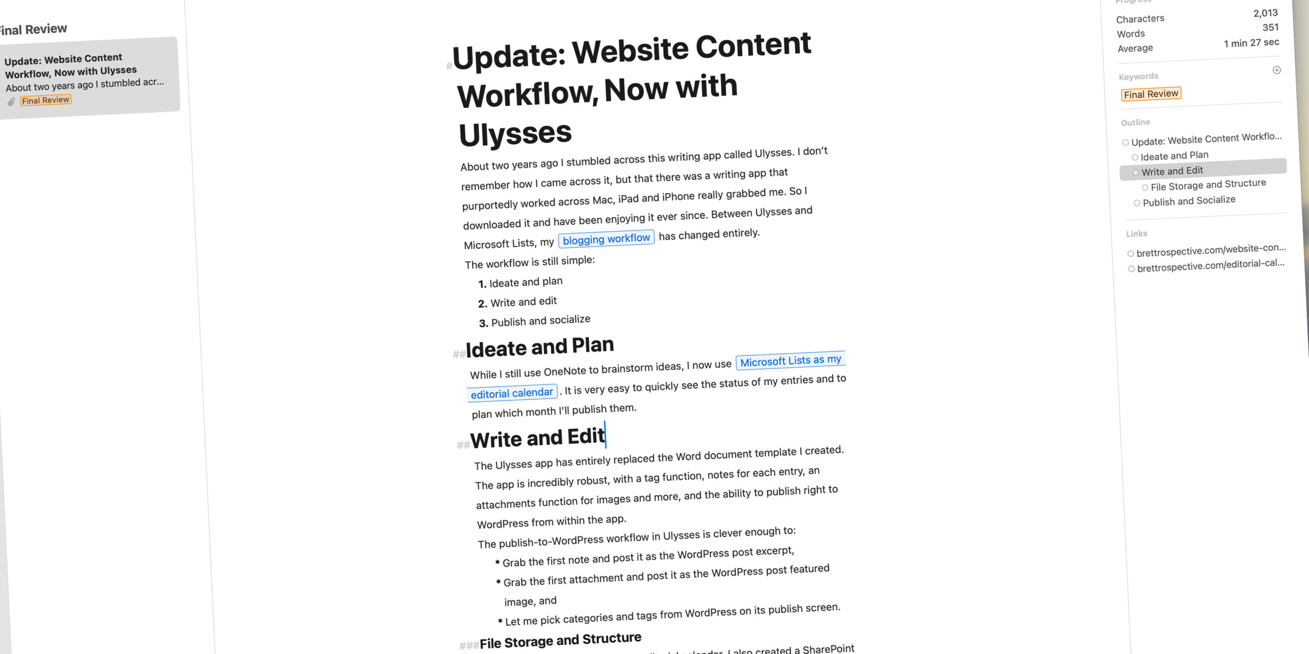
Website Content Workflow

As I’ve (slowly) began writing again, I struggled to remember my workflow for ideating, writing, editing, storing and posting content. It seems like a smart thing to document and doing so was a great reminder of my process. So, here it is. It very closely mirrors the workflow I established at my full-time gig and is a workflow works well for one person writing content—mostly blog entries—for a small website.

The workflow is simple:

  1. Ideate and Plan
  2. Write and Edit
  3. Publish

Ideate and Plan

I use OneNote to brainstorm, organize and schedule my blog entries. I have a section in my Brettro OneNote notebook called “Brettro Website Content.” Inside that section I created pages for each major section of the Brettro website:

  • Blog Entries
  • Pages
  • Portfolio

Each page is then split into two sections:

Brainstorms

OneNote list for brainstorming content

This section is a freeform, bulleted list of ideas for entries; sometimes a bullet is just a word and sometimes it is a more in-depth, complete thought.

Schedule

Planning table in OneNote

This section is a four-column table:

  • Title: the title of the entry
  • Description: the description is a more fleshed-out version of the brainstorm bullet and many times becomes the entry’s excerpt
  • Scheduled Post: anticipated posting date; my goal is to post every two weeks, but clearly that hasn’t been the case in 2019.
  • Actual Post: the date the entry is actually posted.

Like I said in my “My Creative Toolbox” entry, I love OneNote and went all-in on OneNote in 2014 and never looked back. It’s available on every device, it’s easy to send items to it from other apps and its interface is elegant.

Write and Edit

Brettro’s content template in Microsoft Word

Years ago I created a content template Word document that includes places for the excerpt, the meta description, meta tags (though those are less necessary now), the copy and custom text for both posting to Facebook and Twitter. The template has worked really well.

File Structure and Storage

In order to have my drafts and related imagery available everywhere, I keep my website content on my OneDrive. (I have an Office 365 subscription, which I find very useful.) I have a folder named “Brettro Web Content” with four folders inside it that match my OneNote pages—blogs, pages and portfolio—and then an additional one for graphics.

Inside each of those folders I create a unique folder for each blog entry, page or portfolio item (respectively) so that I can store the text and any graphics or photos together. For consistency, I use the following naming conventions for those content folders:

  • Blog entry: entry - YYYY-MM-DD - slug
  • Page: page - section - slug
  • Portfolio: project - YYYY-MM-DD - slug

The graphics folder contains template Photoshop and Illustrator files for sizing featured images and images in the content column correctly.

Publish

Posting an entry to WordPress is a copy-and-paste effort from the Word doc. On the Windows version of Word there is a “Post to Blog” functionality that, for whatever reason, isn’t available on the Mac. That’s disappointing because I think having that functionality would be nice. For the moment, I open my content entry in Word, open WordPress and then copy and paste the content and upload the images to create my entry.

The Perfect User Interface Sketch Pad

I sat down at my laptop, staring at the screen trying to develop a look-and-feel concept for both the new brettro.com and my personal website. I launched Photoshop, mucked around with a grid and started creating some shapes, but it felt too premature to be already designing on the computer.

Sketching with Pencil and Paper

I love the feel of pencil and paper to seed ideas. It’s easy to start and stop, to draw and erase, to crumple up, toss and start over. It just feels more natural, more connected. Working in Photoshop makes everything feel more finished, like an idea is fully cooked. Plus I got bogged down in thinking about what framework (if any) I wanted to use and whether I should set up my Photoshop file using a framework template. I ended up going down a rabbit hole of decisions that didn’t need to be made at the point of ideation. (And, tangentially, I’ve been paying attention to Adobe’s new UX design and development tool called XD.) Everything about starting in Photoshop felt awkward.

So I pulled out a sheet of paper and started sketching. But developing design ideas for websites now requires thinking through how your concept would look on multiple devices. Drawing and re-drawing a desktop area and a tablet area and a smartphone area on a sheet of paper interrupted my creative flow.

“There has to be a sketchpad for user interface ideation,” I thought.

Finding a Sketch Pad

I put down my pencil, picked up my iPad and started surfing, ultimately finding UI Stencils’ Responsive Sketch Pad. The pad is ideal. On one side it has a large browser window and a smartphone window with boxes for project name, screen, version, date and notes.

The front.
The front.

The other side has two browser windows, two tablet windows and two smartphone windows.

The back.
The back.

Every window has very subtle dots in them affording you the opportunity to work on a grid, if you’d like. And the windows on the front side include hash marks for percentage widths on both windows.

Percentages for browser window width.

Using the Sketch Pad

Using the pad is great! The paper is high quality and a little heavier than normal printer paper which makes it rugged enough to handle multiple pencil erasures while still keeping its integrity and looking good. I find the window size on the template to be very functional for getting ideas down, even if I can’t capture the entire vertical page in one template.

Some early sketches for brettro.com.

I’m looking forward to having this pad around as I start to doodle and pull together my ideas about how brettro.com should look.

Content Management Systems I’ve Used

In my two decades of developing and managing websites I’ve used quite a few different website content management systems (CMS). I thought I’d take a minute to document each of them, where I’ve used them and which I prefer.

Content Management Systems I’ve Used

These CMS’s I’ve either developed for, used on a production website or both. They’re listed alphabetically.

Big Medium

Used from 2006 – 2010.

This file-based CMS I used for smaller sites for several years until I realized the developer had essentially stopped working on it (this was in late 2008/early 2009). Soon after, he announced its end of life.

Documentum

Used from 2002 – 2006.

I used this while I worked at the U.S. Senate Sergeant at Arms. It was more than we needed and not easy to use. I stopped using it because I changed employers.

DotNetNuke

Used briefly in 2006.

When I left the Senate and started at my new full-time gig I inherited this CMS for our intranet. I immediately dumped it for flat HTML. The backend was clunky, creating templates was difficult and managing users was not intuitive.

ExpressionEngine

Used from 2009 – 2017.

I also absolutely loved ExpressionEngine. When I started using it in 2009 it was a cutting-edge CMS for both membership sites and for creating a website with a unique content model. The user and developer community were actively engaged and its creator, the developer community and the plugin development community were second-to-none for support. The product was rock solid. After several years, open-source and equally capable products like WordPress and Drupal drained interest in a product with a price tag. I ultimately stopped using ExpressionEngine because the plugin community dwindled, the product was slow to provide updates and it was becoming harder and harder to find developers who had used the product.

WordPress

Used from 2008 – present.

I absolutely love WordPress. The backend interface is gorgeous. Those who use it to publish websites find it incredibly easy to use. With the right plugins, it can power a very high-traffic, high profile website. The user community is massive. This is my “go to” CMS for just about every project.

The Bland Brettrospective

When I sat down to rekindle my blog brettrospective.com hadn’t been touched in nearly seven years, including the custom theme I’d created for it. 

The web changed significantly in that time, most notably the advent of responsive web design. My custom WordPress theme was so dated it was not even responsive. Though I’m starting work on a new responsive custom theme, I wanted the site to be responsive now, so I decided to use a free custom theme during development. The theme is called Independent Publisher 2  and its minimalist design appealed to me.

While I design my new custom theme, I plan to document here the decisions I make and the things I learn. Let the adventure begin!