Diving into Design Systems

It seems like design systems have taken the web world by storm. I feel like everywhere I look there’s a tweet or a blog entry or a conversation about creating or implementing a design system. So I thought I’d dive in and see what this is all about. And in that process, I discovered that this is something I have thought should exist for a long, long time, but I didn’t know what to call it.

After doing a deeper dive into these things, I decided to create a design system for Brettrospective. It might be overkill for a one-man shop, but I learn best by doing, so by creating one I’m learning and earning experience in the process. And it’s fun.

Basic Comprehension

The first thing I do when I want to learn about something is buy a book. Coincidentally, A Book Apart had recently released Expressive Design Systems, which provided a fantastic primer to the overall concept. From there, I read:

I took an in-depth look at Spectrum, Adobe’s design system, to understand its approach, drooled over the visual appeal of Audi’s design system and reveled in the structural elegance of IBM’s Carbon design system. And then I took Demian Borba’s “Creating a Design System with Adobe XD” LinkedIn Learning class.

Getting Started

With a basic understanding of a design system’s structure and contents, I began mapping out the initial structure of the Brettrospective Design System:

  • Color palette;
  • Typography and Text;
  • Iconography; and
  • Components

This isn’t a comprehensive design system structure, but it’s a good start. Over the next few months I’ll be documenting the development of each of these parts here.

Development Tools

As I get started, I’ll be using

  • Microsoft OneNote to jot notes and document decisions; and
  • Adobe XD to create and visualize the details and elements of the system

Check out the My Creative Toolbox entry for a deep dive into the products I use.

Let’s Get Busy

With some good baseline knowledge, great resources and a solid plan, let’s get started! The first thing I’ll be tackling is typography.

Update: The Bland Brettrospective

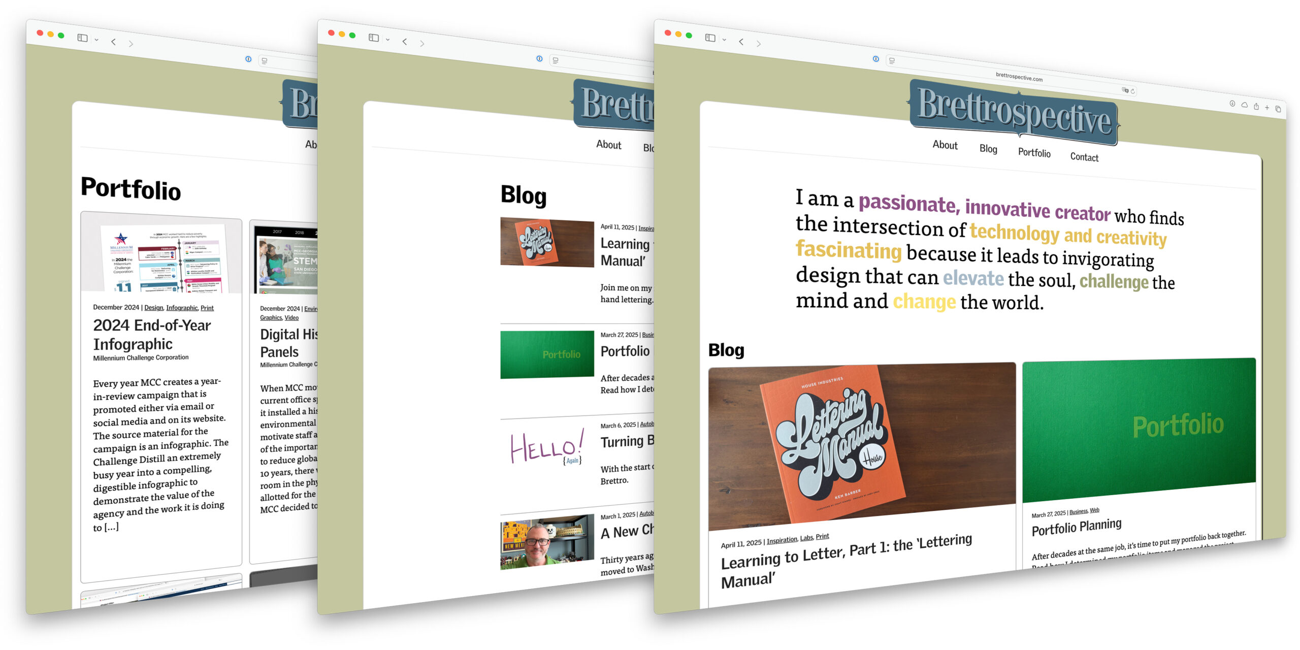
It’s been a minute since I posted about creating a new custom theme for brettro.com, so I thought I’d post an update.

When I sat down and really started thinking about how I wanted to approach this, I realized how much had changed since I developed the last brettro.com WordPress theme. I decided I wanted to keep up with and learn about as many of those changes as possible throughout the entire design and development process, so I’m tackling each step with intention and a willingness to learn.

Step 1: Develop a Design System

Design systems seem to be the natural evolution of atomic design and provide an incredible amount of detail from the vision of a design to the exact pixel dimension of a rounded corner on a button and just about everything in between. I want to do a deep dive into this, create one for Brettrospective and document what I learn along the way.

Step 2: Use a New Tool to Design the User Interface

In 2017 Adobe released XD, an app specifically for creating user interfaces for websites and apps. From the little bit of it I’ve used, it seems to be an incredibly useful and functional app and one that I can see becoming the de facto standard for creating and prototyping interfaces. I’m excited to dive in and learn this tool.

Step 3: Assess my Development Toolbox

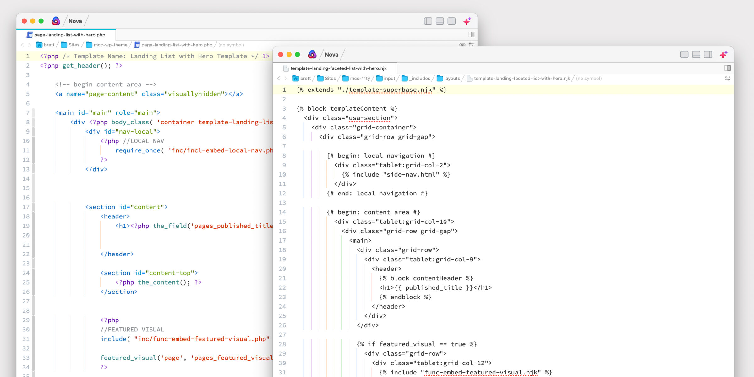
I want to take a look at the tools I use to do my actual development work. I’m both very comfortable with and a huge fan of all the tools I use. I know that Panic, the makers of Coda have Nova , a new code editor, on the horizon and I am very excited about that. And I recently decided to start using GitLab instead of Github. So those are a few changes on the horizon.

Step 4: Develop the Theme

Even though the Brettro WordPress theme won’t be available for anyone to use, I want to develop it to the standard that would get it approved for posting on the WordPress theme directory. Making sure it takes advantage of the newest features of WordPress is an important learning moment for me, as is understanding what elements must be and should be included in a theme. I plan to use the underscores theme as my foundation.

I also want to give some thought to what CSS framework I might use. My previous theme used Bourbon and Bourbon Neat. Recently the folks who created both frameworks discontinued development on Neat and are encouraging people to use modern, native CSS features like Grid and Flexbox. They’re smart to do so and I’m excited to dive into those two CSS features as well.

Documenting It All

Like I said in my original post about this, I plan on documenting the things I learn, the challenges I face and the victories I achieve while creating this new theme. So stay tuned…

My Creative Toolbox

Some time in early 2014 I ran across Tom McFarlin’s post My WordPress Development Toolbox and thought, “how clever and what a great idea!” I immediately sat down and started documenting my own toolbox but didn’t finish it and publish it…until today.

‘Creative’ vs. ‘Development’ Toolbox

While the structure of this post is heavily influenced by Tom’s, I realized as I started to dig into my own toolbox that it has more than just web development tools. I decided to document all of them. (So Tom, if you’re reading this, thank you for the idea and the great outline!) I’ve sectioned my toolbox like this:

Because of that, I chose to call it my “Creative Toolbox.”

Hardware

16” MacBook Pro

I picked this up a few weeks ago after having a 15” MacBook Pro for about a year (and an iMac before that, and a MacBook Pro before that…). I absolutely love this machine. The screen is gorgeous and the extra bit of screen real estate is remarkable. The keyboard has returned to its old, more enjoyable (to me) mechanism and the battery life is great.

11” iPad Pro with Pencil

I’ve always loved the iPad. I use it for reading, emailing, task management, note taking, word processing and working in spreadsheets. I have always been anxious for the day when it can be used for more than just the information consumption and light productivity work I do. With iPadOS, I believe that it will become more of a creation and development powerhouse. With Microsoft’s bevy of Office 365 iPadOS apps and Adobe releasing Photoshop for iPad and working on Illustrator for iPad, the powerhouse tablet is not too far away.

Originally I bought the 12.9” iPad Pro, but it was just that much too big to hold and read or keep with me on the sofa to pick up and poke around on while watching TV. For now, the 11” is perfect for me.

iPhone 11 Pro

I actually debated getting the Max version of the phone this year, but decided to stay with the regular size. I don’t actually use my phone for that much besides listening to music, taking pictures, tracking health stuff, replying to emails and starting notes, so the regular size works best for me.

Software

Brettro had four main capabilities when it was in business: website design and development, visual identity creation and management, print product design and videography and post-production. While most of the software I use is exclusive to a particular practice, you will find some repetition too.

Software for Document Production

  • Document production: I’ve been using Adobe InDesign since it was first released in late 1999. It replaced PageMaker, which I also used. It is an incredibly powerful document production application. It also exports pretty clean HTML, which I do from time to time, and has impressive looking ebook capabilities, though I’ve never used them (but have always wanted to try).
  • Document creation and editing: I use Microsoft Word to create my source documents for review and edit prior to importing the final version into InDesign.

Software for General Productivity

“General productivity” to me is email, task management, note taking and general life organization.

  • Email: I’m old school, I use Apple Mail. I honestly keep a pretty disorganized inbox and a slapdash folder structure. If there’s something actionable in an email, I either flag it to remember later, add it to a to do list or complete it right away.
  • Task Management: I love lists and get a great deal of satisfaction out of crossing something off a list or checking a box when it’s done, but I have yet to settle on a single task management solution.
    • Reminders: I use Apple Reminders for personal stuff like my grocery list, errands and chores. (Being able to say “Hey Siri, add soap to my grocery list” is really nice.)
    • OmniFocus: at one point when I was working my full-time job, going to school full-time and running Brettro part-time, I used OmniFocus religiously with the Getting Things Done (GTD) framework. It was magical. Nowadays I’m less committed to GTD and don’t use OmniFocus that much, but it is an incredible piece of software worthy of a mention.
    • Microsoft To-Do and Planner: as much as I hate to compliment Microsoft, their commitment to Office 365 and rapid deployment of its tools is impressive. Both To-Do and Planner are worthy apps, the former for individual task management and the latter for group task management. As I’m ramping up my writing for this blog, I’m leaning towards using To-Do and Planner for managing tasks related to it. (Stay tuned for a separate entry on Office 365.)
  • Note Taking: since the iPad was released I dreamed of a day that I would be able to use it to take handwritten notes. Every few years I would buy a third-party stylus and try it, but it never felt quite right. Enter the Apple Pencil in 2015 and I never looked back.
    • Nebo: this note taking app is remarkable. It recognizes your handwriting as you write and learns the quirks of your handwriting over time. You can also correct a recognized word by tapping on it and choosing from a list of suggested words. It has iCloud synchronization, though I don’t use it because I keep all my notes in Microsoft OneNote. My only complaint about Nebo is the export-to-OneNote function. While I’m glad something exists, I wish it was a little more native.
    • OneNote: I went all-in on Microsoft OneNote in 2014 and never looked back. I had been using Evernote for awhile, but they kept redesigning the interface and trying out different paid tier models. The constant interface redesigns created an irritating learning curve, plus I was already in the Office 365 ecosystem, so it seemed logical to adopt. Plus the apps were (and still are) available for Mac, iOS and iPadOS and are really quite good. The only thing I don’t like about OneNote is that text recognition for handwritten notes is only available on Windows.
  • Password Management: a client of mine suggested 1Password to me in 2009, I bought it and have never looked back. This is an incredible product that is easy to use, syncs across devices and is available on macOS, iOS, iPadOS and as a web-based app. It also integrates into the browser on macOS and functions as an extension on iOS and iPadOS.

Software for Video

  • Camera: while I don’t shoot much video right now, when I do, I use my iPhone.
  • Post-Production: years ago I used (and preferred) Apple Final Cut Pro, but abandoned it when they rewrote the app in 2011. So I picked up Adobe Premiere Pro. It’s available on for both Mac and PC, which I needed because my full-time job requires me to use a Windows PC (which is a real bummer, let me tell you). I also use Adobe After Effects for motion graphics. And use Adobe Media Encoder to render videos for posting.

Software for Images and Graphics

  • Camera: I am not a photographer. I can take a snapshot, but I cannot shoot a photograph. There is a distinction and I wish I had the skill, but the camera I use when I do take pictures is my iPhone. It’s the one that’s always with me.
  • Image Management: for my personal photos, I use Apple Photos. For large scale projects for clients or friends, I use Adobe Lightroom.
  • Image Editing: like just about everybody else, I use Adobe Photoshop. And probably only use about 1 percent of its total feature set.
  • Graphics Creation and Editing: between Photoshop and Adobe Illustrator, I can create just about any graphic I need to. I’ve been using Illustrator since it was released in 1987 (no, really). Next to MacPaint, it was the app that drew me into the world of design. It has a special place in my heart.
  • Slideshow Creation: on multiple occasions I’ve created slideshows for events. I use Boinx FotoMagico to do so. The software is great and very capable.

Software for Web Design

  • UI Prototyping: most recently, I’ve used Photoshop to create my user interfaces, but as I tackle creating a new UI for brettro.com, I’m excited to dive into Adobe XD.
  • Browsers: now that Internet Explorer is dead, give me all the standards-based web browsers: Safari, Chrome and Edge.

Software for Web Development

  • Web Server and Database: MAMP Pro was recommended to me eons ago. I like it and I’ve never tried anything else.
  • IDE: I’ve used Panic Coda since pretty much the moment they released it in 2007. I’ve always loved the app, from the opening screen containing all your sites and projects to the coding environment that just gets out of the way. the original Coda had a built-in reference library, which I found very useful. Coda 2 made an already great app even better. Recently Panic announced Coda’s replacement, Nova, which I’m very excited to get my hands on and use.
  • FTP: before Coda there was Panic Transmit. I never thought I’d be so excited about an FTP app, but this FTP app is really good. It’s fast. It’s feature complete. And, like Coda, it gets out of the way and lets you do what you need to do.
  • Database: I’m not sure when I first discovered Sequel Pro, but it is such a simple and elegant way to manage, view, edit and create MySQL databases I can’t imagine using anything else.
  • Helpers: I’m not sure how I came across CodeKit, but it does exactly what it says it’s going to do and it’s amazing. Plus it works very hard to work well with other development apps like MAMP. I essentially use it for SASS compiling and JavaScript minification, though I’m sure it does much more.
  • Diff Tool: honestly, I chose Kaleidoscope because I liked the icon. Fortunately for me, the app behind the icon is incredibly good and useful. It integrates with Tower, the source control app I use. for the rare times when I need a diff tool, Kaleidoscope makes it easy to do a compare and solve an issue.
  • Source Control: I was a hardcore Subversion fan for source control, but in either 2013 or 2014 a friend of mine convinced me to switch to Git. And at some point after that I ran across Git Tower for managing my repos. It’s great. I love it. And between their book on using Git and the app itself, it makes using Git incredibly easy.
  • Marking Up HTML Text: while I do my development work in Coda, when I need to mark up a long or complex piece of text, I use Adobe Dreamweaver. The environment feels more tuned to that with menu commands to insert a table (rather than code it yourself) to menu commands to insert special characters. Plus Dreamweaver has a special place in my heart. In the late 90’s when the web was new and I was a fledgling designer/developer, Dreamweaver was the most amazing IDE ever. But it was $300, which priced it out of reach for me for awhile. once I was finally able to afford it, I felt like I’d arrived.

Software for Writing

  • Brainstorming, Outlining and Mind Mapping: like I said above , I use OneNote for capturing notes and ideas.
  • Writing: I’ve tried other word processors and text editors over the years, but I always come back to Microsoft Word. It’s definitely more than I need for blogging, but it’s familiar and ubiquitous.

As Things Change…

This is my toolbox on the day I posted this. As things change I’ll keep it updated.

What Is ‘Uncle Sam, Inc.’?

Besides formerly running a part-time, small media design consultancy, I work full-time for a U.S. government agency. It is my bread-and-butter, the gig that pays me. I’m lucky enough to have a full-time job doing something I love: content creation and management for web, print and video. Especially since I’ve been doing it for nearly 25 years!

It’s important to me to keep a clear separation from and distinction between the work I do for the government and the work I do on my own, be it for my own media design firm or in the writing I do for this blog. Because of that I won’t ever explicitly identify the agency where I work and only in extremely rare situations will I write anything specific about it, but should I mention it, I will refer to it as Uncle Sam, Inc.. (What I will say about it now is that it has an extremely noble mission and the work we do makes me very proud.)

Everything I write about here is something I’ve taken the time to learn on my own, but from time-to-time there are things that happen at work worth mentioning here, mostly about being a manager, but sometimes about working or being a creative in an enterprise environment, too.

Website Content Workflow

As I’ve (slowly) began writing again, I struggled to remember my workflow for ideating, writing, editing, storing and posting content. It seems like a smart thing to document and doing so was a great reminder of my process. So, here it is. It very closely mirrors the workflow I established at my full-time gig and is a workflow works well for one person writing content—mostly blog entries—for a small website.

The workflow is simple:

  1. Ideate and Plan
  2. Write and Edit
  3. Publish

Ideate and Plan

I use OneNote to brainstorm, organize and schedule my blog entries. I have a section in my Brettro OneNote notebook called “Brettro Website Content.” Inside that section I created pages for each major section of the Brettro website:

  • Blog Entries
  • Pages
  • Portfolio

Each page is then split into two sections:

Brainstorms

OneNote list for brainstorming content

This section is a freeform, bulleted list of ideas for entries; sometimes a bullet is just a word and sometimes it is a more in-depth, complete thought.

Schedule

Planning table in OneNote

This section is a four-column table:

  • Title: the title of the entry
  • Description: the description is a more fleshed-out version of the brainstorm bullet and many times becomes the entry’s excerpt
  • Scheduled Post: anticipated posting date; my goal is to post every two weeks, but clearly that hasn’t been the case in 2019.
  • Actual Post: the date the entry is actually posted.

Like I said in my “My Creative Toolbox” entry, I love OneNote and went all-in on OneNote in 2014 and never looked back. It’s available on every device, it’s easy to send items to it from other apps and its interface is elegant.

Write and Edit

Brettro’s content template in Microsoft Word

Years ago I created a content template Word document that includes places for the excerpt, the meta description, meta tags (though those are less necessary now), the copy and custom text for both posting to Facebook and Twitter. The template has worked really well.

File Structure and Storage

In order to have my drafts and related imagery available everywhere, I keep my website content on my OneDrive. (I have an Office 365 subscription, which I find very useful.) I have a folder named “Brettro Web Content” with four folders inside it that match my OneNote pages—blogs, pages and portfolio—and then an additional one for graphics.

Inside each of those folders I create a unique folder for each blog entry, page or portfolio item (respectively) so that I can store the text and any graphics or photos together. For consistency, I use the following naming conventions for those content folders:

  • Blog entry: entry - YYYY-MM-DD - slug
  • Page: page - section - slug
  • Portfolio: project - YYYY-MM-DD - slug

The graphics folder contains template Photoshop and Illustrator files for sizing featured images and images in the content column correctly.

Publish

Posting an entry to WordPress is a copy-and-paste effort from the Word doc. On the Windows version of Word there is a “Post to Blog” functionality that, for whatever reason, isn’t available on the Mac. That’s disappointing because I think having that functionality would be nice. For the moment, I open my content entry in Word, open WordPress and then copy and paste the content and upload the images to create my entry.

The Perfect User Interface Sketch Pad

I sat down at my laptop, staring at the screen trying to develop a look-and-feel concept for both the new brettro.com and my personal website. I launched Photoshop, mucked around with a grid and started creating some shapes, but it felt too premature to be already designing on the computer.

Sketching with Pencil and Paper

I love the feel of pencil and paper to seed ideas. It’s easy to start and stop, to draw and erase, to crumple up, toss and start over. It just feels more natural, more connected. Working in Photoshop makes everything feel more finished, like an idea is fully cooked. Plus I got bogged down in thinking about what framework (if any) I wanted to use and whether I should set up my Photoshop file using a framework template. I ended up going down a rabbit hole of decisions that didn’t need to be made at the point of ideation. (And, tangentially, I’ve been paying attention to Adobe’s new UX design and development tool called XD.) Everything about starting in Photoshop felt awkward.

So I pulled out a sheet of paper and started sketching. But developing design ideas for websites now requires thinking through how your concept would look on multiple devices. Drawing and re-drawing a desktop area and a tablet area and a smartphone area on a sheet of paper interrupted my creative flow.

“There has to be a sketchpad for user interface ideation,” I thought.

Finding a Sketch Pad

I put down my pencil, picked up my iPad and started surfing, ultimately finding UI Stencils’ Responsive Sketch Pad. The pad is ideal. On one side it has a large browser window and a smartphone window with boxes for project name, screen, version, date and notes.

The front.
The front.

The other side has two browser windows, two tablet windows and two smartphone windows.

The back.
The back.

Every window has very subtle dots in them affording you the opportunity to work on a grid, if you’d like. And the windows on the front side include hash marks for percentage widths on both windows.

Percentages for browser window width.

Using the Sketch Pad

Using the pad is great! The paper is high quality and a little heavier than normal printer paper which makes it rugged enough to handle multiple pencil erasures while still keeping its integrity and looking good. I find the window size on the template to be very functional for getting ideas down, even if I can’t capture the entire vertical page in one template.

Some early sketches for brettro.com.

I’m looking forward to having this pad around as I start to doodle and pull together my ideas about how brettro.com should look.

Content Management Systems I’ve Used

In my two decades of developing and managing websites I’ve used quite a few different website content management systems (CMS). I thought I’d take a minute to document each of them, where I’ve used them and which I prefer.

Content Management Systems I’ve Used

These CMS’s I’ve either developed for, used on a production website or both. They’re listed alphabetically.

Big Medium

Used from 2006 – 2010.

This file-based CMS I used for smaller sites for several years until I realized the developer had essentially stopped working on it (this was in late 2008/early 2009). Soon after, he announced its end of life.

Documentum

Used from 2002 – 2006.

I used this while I worked at the U.S. Senate Sergeant at Arms. It was more than we needed and not easy to use. I stopped using it because I changed employers.

DotNetNuke

Used briefly in 2006.

When I left the Senate and started at my new full-time gig I inherited this CMS for our intranet. I immediately dumped it for flat HTML. The backend was clunky, creating templates was difficult and managing users was not intuitive.

ExpressionEngine

Used from 2009 – 2017.

I also absolutely loved ExpressionEngine. When I started using it in 2009 it was a cutting-edge CMS for both membership sites and for creating a website with a unique content model. The user and developer community were actively engaged and its creator, the developer community and the plugin development community were second-to-none for support. The product was rock solid. After several years, open-source and equally capable products like WordPress and Drupal drained interest in a product with a price tag. I ultimately stopped using ExpressionEngine because the plugin community dwindled, the product was slow to provide updates and it was becoming harder and harder to find developers who had used the product.

WordPress

Used from 2008 – present.

I absolutely love WordPress. The backend interface is gorgeous. Those who use it to publish websites find it incredibly easy to use. With the right plugins, it can power a very high-traffic, high profile website. The user community is massive. This is my “go to” CMS for just about every project.

Closing Brettro

After 12 years in business I closed Brettrospective Media’s virtual doors in mid-2017.

I started Brettro in 2005 on a whim. At the time, I was the manager of the technical side of a prominent U.S. government website but I wanted a place to stretch my wings, experiment, learn and have some creative fun with graphic design, web design, web development and content production. Brettrospective Media was born.

Beyond previously developing, launching and managing a handful of websites, I had no idea how different running a business would be.

I didn’t know how to start a business. I didn’t know how to price projects. I didn’t know how to find clients. I didn’t know how to advertise my new venture to family and friends. I didn’t understand that there would be a slight—but important—difference between working with clients and working with colleagues.

But that was the whole point of starting Brettro: to learn. And learn I did. In fact, much of what I learned is captured over the years in this blog.

Brettro was always intended to be a part-time venture and throughout its life, it generally was. But there were times where I stretched myself and there were times where I bit off muchmore than I could chew. Ultimately the combination of working full-time for Uncle Sam and part-time for myself took its toll and in early 2013 I burnt out.

After letting Brettro languish for about four years, I decided in mid-2017 that it was time to close the business.

And while I won’t be taking on any new clients, when the mood strikes I will still be writing about design and business and the things I learn, so check back every once in a while.

The Bland Brettrospective

When I sat down to rekindle my blog brettrospective.com hadn’t been touched in nearly seven years, including the custom theme I’d created for it. 

The web changed significantly in that time, most notably the advent of responsive web design. My custom WordPress theme was so dated it was not even responsive. Though I’m starting work on a new responsive custom theme, I wanted the site to be responsive now, so I decided to use a free custom theme during development. The theme is called Independent Publisher 2  and its minimalist design appealed to me.

While I design my new custom theme, I plan to document here the decisions I make and the things I learn. Let the adventure begin!

Where Have I Been?

It’s been almost seven years since I posted anything on this blog. What happened?

Burnout.

Brettro was always intended to be a fun, part-time experiment. But as time passed, I took on more clients and more complex projects. With an already demanding full-time job, I was burning the candle at both ends trying to meet the needs of my clients and the demands of my job. 

In early 2013 I burnt out. I finished existing projects, turned down new work and fully expected that after a few weeks I would be ready to take on new projects. Weeks turned into months, months turned into years and Brettro sat stagnant. 

Why Am I Writing Again?

Because it’s time. I love creating and I’m passionate about it. I enjoy managing a creative team and I’ve learned so much from the team about being a manager. I get excited about the progression of technology and am eager to learn new tools. These are the things I want to write about: being a creative, being a manager and learning new things and new tools.

Plus I enjoy writing.

So here’s to being back at it. I hope you enjoy reading this blog as much as I enjoy writing it.