Adobe CC Libraries: Paragraph and Character Styles

A few months ago I wrote a post giving an overview of Adobe CC Libraries. Since that time and after integrating them into my workflow, it’s clear that one of its most powerful features is the ability to store paragraph and character styles.

The ability to create a style once and share it not only with others but also with different Adobe apps is remarkable and an incredible time saver.

Establishing Standard, Baseline Styles

From the moment I started desktop publishing in the mid-1980’s, the standard content creation workflow always seems to start in a word processor. Over time Microsoft Word has become the de facto one, so as I formalized my content creation workflow, I decided to standardize my paragraph and character styles on the default ones from Microsoft Word. That way when I place a Word doc in InDesign the style formatting will be automatically applied.

To see all the styles in one place and to have a better understanding of the depth and breadth of the styles, I created a Word doc listing all the standard Word paragraph and character styles.

A Word doc listing all the standard Microsoft Word paragraph and character styles.

Recently I updated that to include a text example of the style.

A Word doc listing all the standard Microsoft Word paragraph and character styles with examples.

Which Adobe Apps Can Use Styles?

According to Adobe’s Help System these Creative Cloud desktop apps can use styles from CC Libraries:

  • Adobe Illustrator,
  • Adobe InDesign, and
  • Adobe Photoshop (character styles only).

As of this writing, CC Libraries don’t have very robust integration into the Creative Cloud mobile apps. Hopefully over time that will change, including making text styles available in the incredible Photoshop and forthcoming Illustrator apps for iPadOS.

Creating Styles

I decided to create my styles in InDesign (versus Illustrator or Photoshop) because InDesign has the most robust set of options when creating them, so it seemed important to create them with the most options defined as possible.

As a starting point, I created a source InDesign document using the Word doc I had made with all the styles listed and with text examples. That way if a style needed to be changed or a new one added, there was a single “source of truth” to update and then that “source of truth” could be easily used to import the styles into a CC Library.

An InDesign file listing all the standard Microsoft Word paragraph and character styles imported into and defined in InDesign with examples.

Organizing the Styles Library

When I initially established my CC Libraries for Brettro, I created one specifically for text styles, appropriately named “Brettro – Typography & Type Styles.” The styles were then organized by group:

  • Paragraph Styles – Front matter: styles for title, subtitle, date, etc.
  • Paragraph Styles – Body matter: styles for headings, body copy, photo captions and credits, etc.
  • Paragraph Styles – Back matter: styles for endnotes, bibliographies, etc.

This seemed like a perfect organization scheme until I realized that many of my styles were different depending on the type of print document I was making. For example, my marketing-focused materials use different titles and headings compared to my long-form documents.

Multiple Type Style Libraries

To minimize confusion, I now have two “source of truth” style documents for InDesign and two CC Libraries for text styles:

  • Brettro – Marketing Material Type Styles: for all type styles necessary to create marketing-style materials like one-to-two page handouts or fact sheets, and
  • Brettro – Presos, Proposals and Pub Type Styles: for all type styles necessary to create long-form documents.

These library names are aligned with how I store and name my documents using a document numbering standard I developed in late 2008.

Type Style Library Groups

I changed the group structure of these libraries to this:

  • Titles & Headings: contains the paragraph styles for the document title, subtitle and the headings
  • Body Copy – Basic: contains the paragraph styles for the body copy paragraph styles
  • Body Copy – Stylized: contains the paragraph styles for the different text elements in the body copy the may need styling, like quotes, captions and photo credits
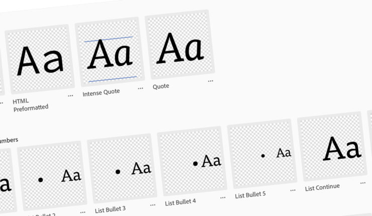
  • Lists – Bullets and Numbers: contains the paragraph styles for the various levels of bulleted and numbered lists
  • Character Styles: contains the character styles for things like bold and italicized text and hyperlinks
  • Document Formatting: contains the paragraph styles for the document headers and footers

This makes it easier to more quickly find the styles I need when I’m working in specific parts of the document.

Wrapping it Up

So there it is: paragraph and character styles in Adobe CC Libraries. The value of this is incredible because now you don’t need to go hunting through InDesign documents to find a style you once created, you can keep them in a CC Library.

Brettro Product Numbering, File Naming and File Structure Standards

For years I wrestled with how to name my creative documents and where to consistently and logically save them.

Then, in 2006 I came across Designing Brand Identity by Alina Wheeler. The book is a comprehensive guide to brand development and maintenance and is an incredible resource for learning how to do it. I have purchased every new edition that has been published since 2006, with the most recent published in 2017.

The one page in the entire book I found the most useful, though, was the page containing a proposed outline for a branding manual. The suggested sections organized creative material in a comprehensive, logical and meaningful way and—for me—really seemed to lend itself to a solid, future proof file structure.

Establishing the File Structure

Screen shot of the directory structure using the product categores.

The file structure is divided into 20 folders that align with the primary product categories defined in Designing Brand Identity. They are:

  • 001 – Brand Identity Elements
  • 002 – Nomenclature
  • 003 – Color
  • 004 – Signatures
  • 005 – Typography
  • 006 – U.S. Business Papers
  • 007 – International Business Papers
  • 008 – Digital Media
  • 009 – Forms
  • 010 – Marketing Materials
  • 011 – Advertising
  • 012 – Presos, Proposals and Pubs
  • 013 – Exhibits
  • 014 – Signage
  • 015 – Vehicle Identification
  • 016 – Packaging
  • 017 – Uniforms
  • 018 – Ephemera
  • 019 – Image Library
  • 020 – Reproduction Files

Files are saved in their own folder within each of these folders using the file naming standard I developed.

Establishing the Product Numbering Standard

I use my product numbering standard for all my visually branded documents, videos and other creative materials. This standard creates a unique identifier for each product allowing it to be easily identified and located.

The number is a quartet combining four groupings to create a unique number:

  • Calendar year: including the calendar year as part of the product number provides instant recognition for the year the product was created, context for discussions on how the product has aged and can serve as a guidepost for referencing invoices for material production;
  • Product category: the product category is a reference to the file structure outlined above; this number makes it significantly easier to find a file in the file structure by narrowing the search to a single folder;
  • Unique ID: this number is the only truly unique identifier for a product in the standard. This four-digit number can only be used once and is the thing used to identify a product in its product category folder. See “Creating the Unique ID” to learn how this number is created.
  • Version number: this number indicates the version of the product.
Breaking down the product number quartet.

Creating the Unique ID

Figuring out how to create a unique number and maintain a list of those numbers was the most challenging part of establishing this standard. I finally settled on an Excel file that creates a unique ID based on the row number in the spreadsheet.

This column uses a function to add 1 to the current row ID to create the product's unique ID.
This column uses a function to add 1 to the current row ID to create the product’s unique ID.

This means, however, that you cannot delete a row once an entry has been created, otherwise it will ruin the whole unique ID scheme. That is a pretty big flaw, but since I am the only person who uses this system on Brettro material, it is functional.

Framework for Determining Version Numbering

Determining when and how to assign a new version number versus a new product number versus not assigning anything new can be difficult. That decision requires a framework to make the determination and that framework is based around the product’s lifecycle. Every product has a usable life: there is a defined beginning and a defined ending, but the tricky part is defining how a product changes between its beginning and ending

The decision framework has four basic questions:

  1. Is this a new product? A new product is an item that has not yet been created or the product’s design or content is completely changed. A new product requires an entirely new product number that resets the version back to one.
  2. Is this a revision or an edit? A revision is a modification to an existing product’s design or content that changes or clarifies the design’s or content’s original intent, message, or theme. An edit is a minor modification to an existing product’s design or content that does not change the design’s or the content’s intent, message, or theme. An edit typically corrects grammar, spelling, or style.
    1. Revision: requires a new version number.
    2. Edit: does not require a new version number.
  3. Is this a periodical or a serial? A periodical and a serial are products created and published multiple times annually with a similar topic or theme. These are special cases in versioning where each new issue results in the creation of a new version number, not a new product number. A new product number, however, is created at the beginning of every calendar year.

    Examples of periodicals are catalogs and newsletters. And examples of serials are brochures, quarterly reports and semi-annual reports.
  4. Is this a build? A build is a unique draft created in the design phase of a product. Many designers create multiple builds of a product as part of their creative process. Once a build is determined to be the final design, the other builds should be deleted or placed in a folder named “builds.” A build does not requires a new version number. When saving a build file add a lowercase letter after the version number to indicate a unique build. For example, in this filename, 2010-002-0001-02a.indd, the lowercase letter a indicates a unique build.

Developing the Folder and File Naming Standard

The folder and file naming standard is based on both the product categories established in the file structure section and product numbering standard section.

The folder naming convention is XXXX-XXX-XXXX – type – three word slug.

Folder naming convention

The file naming convention is XXXX-XXX-XXXX-XX – type – three word slug.

File naming convention

Product Type

The product type is a secondary categorization that more granularly describes the type of product being created. I developed the initial list of product types referencing Wheeler’s Designing Brand Identity, but over time have added others.

Product types should describe a product in general terms and should follow the “one-to-many” principle whereby the product type (the one) generally describes multiple types of products (the many) in one or two words. New product types can be added, but should be done so rarely.

The source list of product types is kept in the Excel file used for creating unique IDs.

Screen shot of the product type list in my file naming spreadsheet.

Three Word Slug

The three word slug should describe the purpose and/or content of the product. I do my best to limit myself to three words, but sometimes I end up using four or five.

Product Tracker Spreadsheet

The spreadsheet I use to track and create unique IDs functions as more than just that. Its primary function is a product tracker to capture not only a product’s unique ID but also to capture its product category, product type and slug.

Thirteen Years and Counting

I have been consistently using this standard for 13 years both at Brettro and Uncle Sam, Inc. It has held up very well in both places with no significant changes in that time.

Diving into Design Systems

It seems like design systems have taken the web world by storm. I feel like everywhere I look there’s a tweet or a blog entry or a conversation about creating or implementing a design system. So I thought I’d dive in and see what this is all about. And in that process, I discovered that this is something I have thought should exist for a long, long time, but I didn’t know what to call it.

After doing a deeper dive into these things, I decided to create a design system for Brettrospective. It might be overkill for a one-man shop, but I learn best by doing, so by creating one I’m learning and earning experience in the process. And it’s fun.

Basic Comprehension

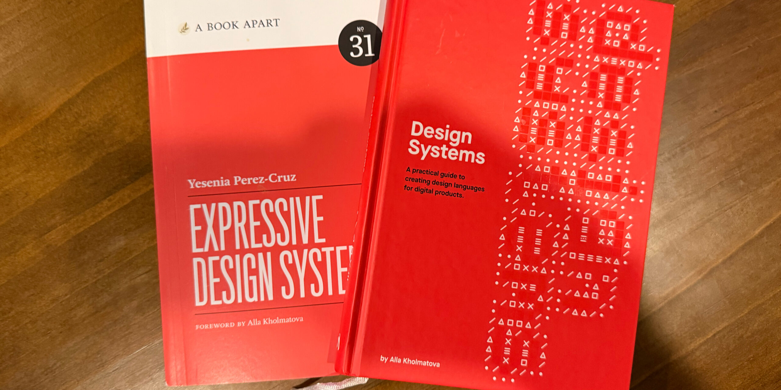
The first thing I do when I want to learn about something is buy a book. Coincidentally, A Book Apart had recently released Expressive Design Systems, which provided a fantastic primer to the overall concept. From there, I read:

I took an in-depth look at Spectrum, Adobe’s design system, to understand its approach, drooled over the visual appeal of Audi’s design system and reveled in the structural elegance of IBM’s Carbon design system. And then I took Demian Borba’s “Creating a Design System with Adobe XD” LinkedIn Learning class.

Getting Started

With a basic understanding of a design system’s structure and contents, I began mapping out the initial structure of the Brettrospective Design System:

  • Color palette;
  • Typography and Text;
  • Iconography; and
  • Components

This isn’t a comprehensive design system structure, but it’s a good start. Over the next few months I’ll be documenting the development of each of these parts here.

Development Tools

As I get started, I’ll be using

  • Microsoft OneNote to jot notes and document decisions; and
  • Adobe XD to create and visualize the details and elements of the system

Check out the My Creative Toolbox entry for a deep dive into the products I use.

Let’s Get Busy

With some good baseline knowledge, great resources and a solid plan, let’s get started! The first thing I’ll be tackling is typography.

Update: The Bland Brettrospective

It’s been a minute since I posted about creating a new custom theme for brettro.com, so I thought I’d post an update.

When I sat down and really started thinking about how I wanted to approach this, I realized how much had changed since I developed the last brettro.com WordPress theme. I decided I wanted to keep up with and learn about as many of those changes as possible throughout the entire design and development process, so I’m tackling each step with intention and a willingness to learn.

Step 1: Develop a Design System

Design systems seem to be the natural evolution of atomic design and provide an incredible amount of detail from the vision of a design to the exact pixel dimension of a rounded corner on a button and just about everything in between. I want to do a deep dive into this, create one for Brettrospective and document what I learn along the way.

Step 2: Use a New Tool to Design the User Interface

In 2017 Adobe released XD, an app specifically for creating user interfaces for websites and apps. From the little bit of it I’ve used, it seems to be an incredibly useful and functional app and one that I can see becoming the de facto standard for creating and prototyping interfaces. I’m excited to dive in and learn this tool.

Step 3: Assess my Development Toolbox

I want to take a look at the tools I use to do my actual development work. I’m both very comfortable with and a huge fan of all the tools I use. I know that Panic, the makers of Coda have Nova , a new code editor, on the horizon and I am very excited about that. And I recently decided to start using GitLab instead of Github. So those are a few changes on the horizon.

Step 4: Develop the Theme

Even though the Brettro WordPress theme won’t be available for anyone to use, I want to develop it to the standard that would get it approved for posting on the WordPress theme directory. Making sure it takes advantage of the newest features of WordPress is an important learning moment for me, as is understanding what elements must be and should be included in a theme. I plan to use the underscores theme as my foundation.

I also want to give some thought to what CSS framework I might use. My previous theme used Bourbon and Bourbon Neat. Recently the folks who created both frameworks discontinued development on Neat and are encouraging people to use modern, native CSS features like Grid and Flexbox. They’re smart to do so and I’m excited to dive into those two CSS features as well.

Documenting It All

Like I said in my original post about this, I plan on documenting the things I learn, the challenges I face and the victories I achieve while creating this new theme. So stay tuned…

The Perfect User Interface Sketch Pad

I sat down at my laptop, staring at the screen trying to develop a look-and-feel concept for both the new brettro.com and my personal website. I launched Photoshop, mucked around with a grid and started creating some shapes, but it felt too premature to be already designing on the computer.

Sketching with Pencil and Paper

I love the feel of pencil and paper to seed ideas. It’s easy to start and stop, to draw and erase, to crumple up, toss and start over. It just feels more natural, more connected. Working in Photoshop makes everything feel more finished, like an idea is fully cooked. Plus I got bogged down in thinking about what framework (if any) I wanted to use and whether I should set up my Photoshop file using a framework template. I ended up going down a rabbit hole of decisions that didn’t need to be made at the point of ideation. (And, tangentially, I’ve been paying attention to Adobe’s new UX design and development tool called XD.) Everything about starting in Photoshop felt awkward.

So I pulled out a sheet of paper and started sketching. But developing design ideas for websites now requires thinking through how your concept would look on multiple devices. Drawing and re-drawing a desktop area and a tablet area and a smartphone area on a sheet of paper interrupted my creative flow.

“There has to be a sketchpad for user interface ideation,” I thought.

Finding a Sketch Pad

I put down my pencil, picked up my iPad and started surfing, ultimately finding UI Stencils’ Responsive Sketch Pad. The pad is ideal. On one side it has a large browser window and a smartphone window with boxes for project name, screen, version, date and notes.

The front.
The front.

The other side has two browser windows, two tablet windows and two smartphone windows.

The back.
The back.

Every window has very subtle dots in them affording you the opportunity to work on a grid, if you’d like. And the windows on the front side include hash marks for percentage widths on both windows.

Percentages for browser window width.

Using the Sketch Pad

Using the pad is great! The paper is high quality and a little heavier than normal printer paper which makes it rugged enough to handle multiple pencil erasures while still keeping its integrity and looking good. I find the window size on the template to be very functional for getting ideas down, even if I can’t capture the entire vertical page in one template.

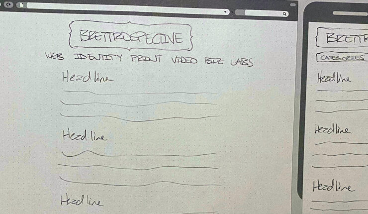
Some early sketches for brettro.com.

I’m looking forward to having this pad around as I start to doodle and pull together my ideas about how brettro.com should look.

Seeing Steve Jobs Everyday for 26 Years

I am more emotional about Steve Jobs’ death than I thought I would be. My first instinct was to quash those emotions because it seemed unnatural to be so moved by the death of someone I did not personally know. But then I realized that his vision, passion, charisma, tenacity, perfectionism and ambition have been present for over two-thirds of my life in the very products I used to discover those very same attributes and desires in myself.

I knew Steve because he put so much of himself in the very machines I used to capture my deepest, scariest, saddest, most ambitious, craziest, looniest, cleverest, funniest, ham-handed-est, ridiculest (yes, I know it’s not a word), dreamiest thoughts, fears, ambitions, goals, concepts, drawings, visions and ideas.

I have owned or had assigned to me somewhere near 20 Macs since the first one arrived at my house on a Friday night in 1985. With those Macs as markers and if referenced by name, I can tell you where I was living, what music I liked, the software I used and owned, the friends and crushes I had, who I was talking to online (or if the Internet even existed) and the things that were going on in my life. That I can do this with a product easily dismissed as “consumer technology” is amazing. I mean, who can do this with a VCR?

That Steve taught me to respect polish and perfection, to look outside of “what everybody else is doing,” to amplify that little voice in my head and to respect how humans interact with technology all through the design and presentation of his products is nothing short of astonishing.

I do not idolize people. I think doing so is unfair to them. But I very much model my business and my professional behavior after Steve. He saw both the value of and opportunity in the personal computer and he knew that if he made the most perfect product possible, then he would truly achieve something.

While I know I am no Steve Jobs, I suspect that he would say, “good, you shouldn’t be. You should be Brett Bearce. And you should work to make insanely great things.”

Strategory

About nine months ago, I wrote about a strategic shift in the foundational elements Brettro will use to design websites for its customers. The rumblings about HTML5 were becoming louder, I had just finished deploying my first full-scale, medium size website using ExpressionEngine and I had deployed a handful of mediocre (on the coding side) WordPress sites. (They have since become less mediocre.) The benefit of using products with a solid, committed design, developer and fan base behind them, like ExpressionEngine and WordPress, really began to gel with me.

Platforms and Coding

My skill is in coding, my passion is in creating meaningful, usable user experiences and content, my “superhero strength” is managing projects and my “weakest link” is my design chops. Recognizing this, I decided it was time to step up my game and create a plan combining my skill, passion, “superhero strength” and “weakest link” into a functioning business strategy and workflow.

Step one:

  • professionalize my internal processes,
  • document coding standards for Brettro,
  • develop a sustainable platform for client documentation, and
  • really sink my teeth into merging my “mad coding skills” with the best practices for developing websites using both WordPress and ExpressionEngine.

In that time, and largely through Twitter, I have found an incredible and helpful community surrounding both EE and WP. I started more professional code management using Subversion (and an amazing Mac client called Versions). I have launched my HTML5 codebase. I have created nearly 13 WordPress plugins (and, in many cases, had to completely scrap and re-create them as I learned more and more about WP coding best practices).

In short, I’m well on my way to achieving my goals of becoming more familiar with and better at coding for two brilliantly executed, powerhouse web publishing platforms.

But there’s more to do…

Design, Design, Design

If anything has suffered through all this, it is the design of the Brettro web properties. They are certainly not horrible—and definitely don’t rank amongst the legacy 1996-era sites with all the visual appeal of an avocado green refrigerator—but they are my weakest link.

With comfortable knowledge of HTML5, Subversion and WordPress under my belt, it is time to focus on Step Two: creating a visually rich, responsive, usable, compelling interface for our websites. (The Brettro web properties use WordPress, but that’s a different discussion for a different time. Coming soon, though.)

I’m excited by this next step. Design has always been the biggest struggle for me. I understand the basic concepts, but the crippling self-doubt (which apparently plagues most of the design types I follow on Twitter) about the elegance and visual appeal of the concepts I develop keep me from executing my best work. It’s in there. I know it is. I just need to take a deep breath, walk away from time-to-time, and push through the doubt.

Soon enough you’ll see those efforts come to light. And your feedback will be important.

But there’s still more to do…

Content, Education, Engagement

This is the point where I become so overwhelmed by the sheer volume of things I need to do, learn and participate in. But then I recognize how excited I am by all of it! And really, this batch of “more to do”—also known as Step 3–is really best done by intertwining it throughout the other efforts on a day to day basis:

  • Education in this arena never stops. And that’s one thing I absolutely love about it.
  • Strategically writing content for the web is such a compelling activity, especially with advocates (and professional heroes of mine) like Kristina Halvorson and Erin Kissane making such strong showings for its benefits
  • And Washington, DC has some absolutely brilliant programmers and designers with which to engage. I look forward to becoming an active and beneficial part of the community.

So, guess what? It’s time to get busy. Come back to read about and see the progress as it unfolds. It’s going to be exciting!