Update: The Bland Brettrospective

It’s been a minute since I posted about creating a new custom theme for brettro.com, so I thought I’d post an update.

When I sat down and really started thinking about how I wanted to approach this, I realized how much had changed since I developed the last brettro.com WordPress theme. I decided I wanted to keep up with and learn about as many of those changes as possible throughout the entire design and development process, so I’m tackling each step with intention and a willingness to learn.

Step 1: Develop a Design System

Design systems seem to be the natural evolution of atomic design and provide an incredible amount of detail from the vision of a design to the exact pixel dimension of a rounded corner on a button and just about everything in between. I want to do a deep dive into this, create one for Brettrospective and document what I learn along the way.

Step 2: Use a New Tool to Design the User Interface

In 2017 Adobe released XD, an app specifically for creating user interfaces for websites and apps. From the little bit of it I’ve used, it seems to be an incredibly useful and functional app and one that I can see becoming the de facto standard for creating and prototyping interfaces. I’m excited to dive in and learn this tool.

Step 3: Assess my Development Toolbox

I want to take a look at the tools I use to do my actual development work. I’m both very comfortable with and a huge fan of all the tools I use. I know that Panic, the makers of Coda have Nova , a new code editor, on the horizon and I am very excited about that. And I recently decided to start using GitLab instead of Github. So those are a few changes on the horizon.

Step 4: Develop the Theme

Even though the Brettro WordPress theme won’t be available for anyone to use, I want to develop it to the standard that would get it approved for posting on the WordPress theme directory. Making sure it takes advantage of the newest features of WordPress is an important learning moment for me, as is understanding what elements must be and should be included in a theme. I plan to use the underscores theme as my foundation.

I also want to give some thought to what CSS framework I might use. My previous theme used Bourbon and Bourbon Neat. Recently the folks who created both frameworks discontinued development on Neat and are encouraging people to use modern, native CSS features like Grid and Flexbox. They’re smart to do so and I’m excited to dive into those two CSS features as well.

Documenting It All

Like I said in my original post about this, I plan on documenting the things I learn, the challenges I face and the victories I achieve while creating this new theme. So stay tuned…

The Perfect User Interface Sketch Pad

I sat down at my laptop, staring at the screen trying to develop a look-and-feel concept for both the new brettro.com and my personal website. I launched Photoshop, mucked around with a grid and started creating some shapes, but it felt too premature to be already designing on the computer.

Sketching with Pencil and Paper

I love the feel of pencil and paper to seed ideas. It’s easy to start and stop, to draw and erase, to crumple up, toss and start over. It just feels more natural, more connected. Working in Photoshop makes everything feel more finished, like an idea is fully cooked. Plus I got bogged down in thinking about what framework (if any) I wanted to use and whether I should set up my Photoshop file using a framework template. I ended up going down a rabbit hole of decisions that didn’t need to be made at the point of ideation. (And, tangentially, I’ve been paying attention to Adobe’s new UX design and development tool called XD.) Everything about starting in Photoshop felt awkward.

So I pulled out a sheet of paper and started sketching. But developing design ideas for websites now requires thinking through how your concept would look on multiple devices. Drawing and re-drawing a desktop area and a tablet area and a smartphone area on a sheet of paper interrupted my creative flow.

“There has to be a sketchpad for user interface ideation,” I thought.

Finding a Sketch Pad

I put down my pencil, picked up my iPad and started surfing, ultimately finding UI Stencils’ Responsive Sketch Pad. The pad is ideal. On one side it has a large browser window and a smartphone window with boxes for project name, screen, version, date and notes.

The front.
The front.

The other side has two browser windows, two tablet windows and two smartphone windows.

The back.
The back.

Every window has very subtle dots in them affording you the opportunity to work on a grid, if you’d like. And the windows on the front side include hash marks for percentage widths on both windows.

Percentages for browser window width.

Using the Sketch Pad

Using the pad is great! The paper is high quality and a little heavier than normal printer paper which makes it rugged enough to handle multiple pencil erasures while still keeping its integrity and looking good. I find the window size on the template to be very functional for getting ideas down, even if I can’t capture the entire vertical page in one template.

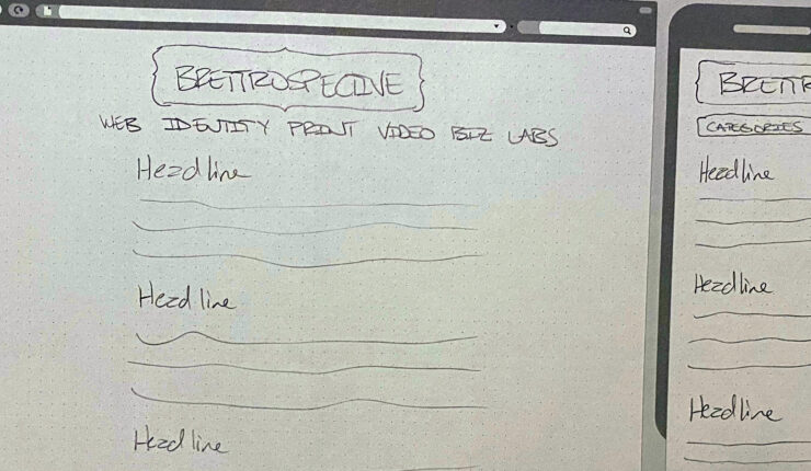
Some early sketches for brettro.com.

I’m looking forward to having this pad around as I start to doodle and pull together my ideas about how brettro.com should look.

Strategory

About nine months ago, I wrote about a strategic shift in the foundational elements Brettro will use to design websites for its customers. The rumblings about HTML5 were becoming louder, I had just finished deploying my first full-scale, medium size website using ExpressionEngine and I had deployed a handful of mediocre (on the coding side) WordPress sites. (They have since become less mediocre.) The benefit of using products with a solid, committed design, developer and fan base behind them, like ExpressionEngine and WordPress, really began to gel with me.

Platforms and Coding

My skill is in coding, my passion is in creating meaningful, usable user experiences and content, my “superhero strength” is managing projects and my “weakest link” is my design chops. Recognizing this, I decided it was time to step up my game and create a plan combining my skill, passion, “superhero strength” and “weakest link” into a functioning business strategy and workflow.

Step one:

  • professionalize my internal processes,
  • document coding standards for Brettro,
  • develop a sustainable platform for client documentation, and
  • really sink my teeth into merging my “mad coding skills” with the best practices for developing websites using both WordPress and ExpressionEngine.

In that time, and largely through Twitter, I have found an incredible and helpful community surrounding both EE and WP. I started more professional code management using Subversion (and an amazing Mac client called Versions). I have launched my HTML5 codebase. I have created nearly 13 WordPress plugins (and, in many cases, had to completely scrap and re-create them as I learned more and more about WP coding best practices).

In short, I’m well on my way to achieving my goals of becoming more familiar with and better at coding for two brilliantly executed, powerhouse web publishing platforms.

But there’s more to do…

Design, Design, Design

If anything has suffered through all this, it is the design of the Brettro web properties. They are certainly not horrible—and definitely don’t rank amongst the legacy 1996-era sites with all the visual appeal of an avocado green refrigerator—but they are my weakest link.

With comfortable knowledge of HTML5, Subversion and WordPress under my belt, it is time to focus on Step Two: creating a visually rich, responsive, usable, compelling interface for our websites. (The Brettro web properties use WordPress, but that’s a different discussion for a different time. Coming soon, though.)

I’m excited by this next step. Design has always been the biggest struggle for me. I understand the basic concepts, but the crippling self-doubt (which apparently plagues most of the design types I follow on Twitter) about the elegance and visual appeal of the concepts I develop keep me from executing my best work. It’s in there. I know it is. I just need to take a deep breath, walk away from time-to-time, and push through the doubt.

Soon enough you’ll see those efforts come to light. And your feedback will be important.

But there’s still more to do…

Content, Education, Engagement

This is the point where I become so overwhelmed by the sheer volume of things I need to do, learn and participate in. But then I recognize how excited I am by all of it! And really, this batch of “more to do”—also known as Step 3–is really best done by intertwining it throughout the other efforts on a day to day basis:

  • Education in this arena never stops. And that’s one thing I absolutely love about it.
  • Strategically writing content for the web is such a compelling activity, especially with advocates (and professional heroes of mine) like Kristina Halvorson and Erin Kissane making such strong showings for its benefits
  • And Washington, DC has some absolutely brilliant programmers and designers with which to engage. I look forward to becoming an active and beneficial part of the community.

So, guess what? It’s time to get busy. Come back to read about and see the progress as it unfolds. It’s going to be exciting!