Exporting InDesign to HTML: Images

Tl;dr: skip to Putting It All Together to read the conclusion without having to read the adventure it took to get there.

Overview

This is part 3 of a multi-part series where I do a deep dive into Adobe InDesign’s export to HTML functionality, with this post’s focus on images.

Part 1, Exporting InDesign to HTML: The Basics took a look at exporting basic document elements: title, headers, text (including bolded and italicized text), bulleted lists and numbered lists.

Part 2, Exporting InDesign to HTML: Tables took a look at the steps necessary to export semantically correct tables from InDesign to HTML.

Background

I much prefer posting long-form documents to the web as HTML. It’s not that I dislike PDFs, but experiencing a PDF on a smartphone and, sometimes, on a tablet is irritating. But creating a PDF is much faster than marking up a long document in HTML.

Enter Adobe InDesign, a document production app most often associated with print documents (and PDFs). But in the past few years Adobe has worked to make it viable in the digital publishing space. And one aspect of that is the ability to export a document to HTML.

That functionality intrigues me because the potential efficiencies created by a fully-featured, well-executed export function are measurable. So I decided to do a deep dive into this with three questions framing my assessment:

  • How semantic and clean is the markup on export?
  • How does a complex document export to HTML?
  • How robust are the options when exporting to HTML?

The Approach

I want to continue being methodical about this, so that as I found pitfalls in the process I would be able to know where to fix things and adjust along the way.

My approach:

  1. In a change from my previous posts, I did not update the source Word document. In my experience, images (or other vector or raster graphics) are usually independent files placed in InDesign;
  2. Identify often-used elements, like a photo caption and a photo credit, to ensure that images needing those elements export correctly;
  3. Use the standard paragraph and character styles found in Word, if possible, to be consistent across apps and, if not possible, create the necessary new ones; and
  4. Iteratively add complexity once I met with success doing the simple markup export and successes with each level of complexity added.

Often-Used Elements with Images

In many instances, a placed graphic will need a caption or a credit of some kind. And in those instances in HTML, the following things need to happen:

  • The <img> tag should be wrapped in the <figure> tag;
    • Solution: Create paragraph style called Figure, assign <figure> tag to export tag
  • The <img> tag’s alt parameter needs to have content added;
    • Solution: select the image, right-click, then choose Object Export Options…
  • The image caption and/or credit needs to be wrapped in the <figcaption> tag;
    • Solution:
      • create an object style called Image Figcaption;
      • Assign <figcaption> to the Export Tagging and assign it to the text box containing both the caption and the credit (both of which have their own paragraph styles;

Export Attempts

It took me 28 export attempts spread across several hours over the course of several days before I finally had the HTML exporting correctly. Rather than detail each of those attempts, I’m just going to go directly to the solution.

Putting It All Together

This is a multi-step process involving creating paragraph styles, object styles, text and image frames and grouping them all together. Once one is created, though, it can be added to an Adobe CC Library so that it’s easily available whenever it’s needed.

Create New Paragraph Styles

  • Caption: create a new paragraph style named Caption and in the “Export Tagging” option assign:
    • Tag: p
    • Include Classes in HTML: checked
    • Class: caption
  • Credit: create a new paragraph style named Credit and in the “Export Tagging” option assign:
    • Tag: p
    • Include Classes in HTML: checked
    • Class: credit
  • Figure: you’ll never actually assign this style to anything, but one of the Object Styles you’ll create below does; it’s necessary for spacing. Create a new paragraph style named Figure and in the “Export Tagging” option assign:
    • Tag: figure

Create the Object Styles

Ended up creating three object styles: one called Figure, one called Image Normal and one called Image Figcaption. Combined together, these three object styles successfully create almost semantically correct HTML output.

  • Create the Figure object style :
    • Anchored Object Options:
      • Position: choose Inline or Above Line
      • Select Above Line
        • Alignment: left
          • Space before: 0
          • Space after: 0
    • Export tagging:
      • Tag: enter figure
  • Create Image Normal object style
    • Basic Attributes
      • Paragraph style: assign Figure
      • Text Wrap: off
      • Anchored Object Options:
        • Position: choose Inline or Above Line
        • Select Above Line
          • Alignment: left
          • Space before: 0
          • Space after: 15
      • Export Tagging: leave set to [automatic]
    • Export Options > Alt Text choose Custom from “Alt Text Source” menu
  • Create the Image Figcaption object style
    • Basic Attributes
      • Anchored Object Options:
        • Position: choose Custom
        • Anchored Object Reference Point: choose the upper, left-hand square in the grid
        • Anchored Position Reference Point: choose the middle, left-hand square in the grid with:
          • X Relative To: choose Text Frame with X Offset at 0
          • Y Relative To: choose Baseline with Y Offset at 0
      • Export Tagging:
        • Tag: enter figcaption

Create a Group of Text and Image Frames and Assign Object Styles

These three object styles need to be combined together to create one object that will export to semantically correct HTML for images with captions and/or credits.

  1. Create a frame and assign it the Figure object style. Make sure the frame is wide enough to stretch from the left to right margin of your document and tall enough to take up about half a page.
  2. Create another frame and assign it the Image Normal object style. (It helps to place an image in the frame.)
  3. Create a third frame and assign it the Image Figcaption object style. In that frame insert the following text:
    1. Photo credit and assign it the Credit paragraph style
    2. Caption and assign it the Caption paragraph style
  4. Select the Image Normal frame and cut and paste it into the Figure frame.
  5. Select the Image Figcaption frame and cut and paste it into the Figure frame below the Image Normal frame

Add it to Your CC Library

Add this new group of frames to your “Presos, Proposals and Pubs” CC library so you can easily insert this into documents later.

  1. Select the Figure frame
  2. From the CC Library palette click the + button and choose Graphic.

Inserting a Figure

Insert the Figure text frame inline wherever you need an image placed.

Exporting to HTML

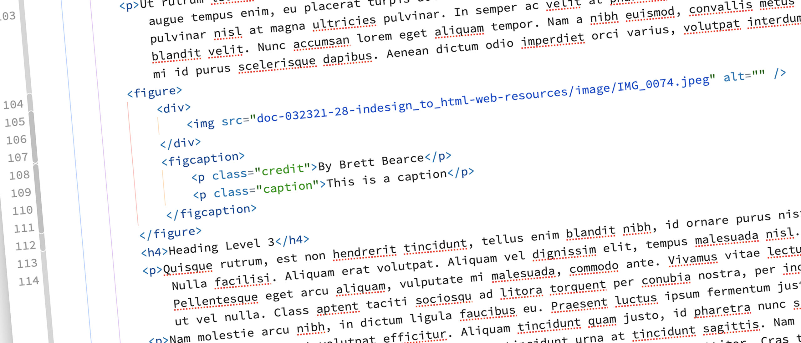
On my 28th—and first successful—export attempt, I used the following settings.

Export Screen

To export to HTML:

  1. Choose Export… from the File menu
  2. In the “Export” window:
    1. Enter a filename in the “Save As” field (it is pre-populated with the name of your InDesign file)
    2. Choose HTML from the “Format” dropdown menu
    3. Click Save
  3. In the “HTML Export Options” window:
    1. General: I left everything as-is
    2. Image: I left everything as-is
    3. Advanced: I chose Include classes in HTML with Generate CSS and Preserve Local Overrides not checked.
  4. Click OK

HTML Markup Review

A quick review of the markup shows a semantically correct marked up image.

What’s Next?

I’ve covered mapping the basic HTML tags in part 1 and exporting tables in part 2. Those two entries, combined with this post about images, should cover the majority of use cases. There are, however, often-used HTML tags that do need to be addressed and I’ll be taking a look at those in my next entry in this series.

Exporting InDesign to HTML: the Basics

Tl;dr: skip to Putting It All Together to read the conclusion without having to read the adventure it took to get there.

Overview

I much prefer posting long-form documents to the web as HTML. It’s not that I dislike PDFs, but experiencing a PDF on a smartphone and, sometimes, on a tablet is irritating. But creating a PDF is much faster than marking up a long document in HTML.

Enter Adobe InDesign, a document production app most often associated with print documents (and PDFs). But in the past few years Adobe has worked to make it viable in the digital publishing space. And one aspect of that is the ability to export a document to HTML.

That functionality intrigues me because the potential efficiencies created by a fully-featured, well-executed export function are measurable. So I decided to do a deep dive into this with three questions framing my assessment:

  • How semantic and clean is the markup on export?
  • How does a complex document export to HTML?
  • How robust are the options when exporting to HTML?

The Approach

I wanted to be methodical about this, so as I found the pitfalls in the process I wanted to be able to know where to fix things and adjust along the way.

My approach:

  1. Create a source Word document;
  2. Use the standard paragraph and character styles found in Word to be consistent across apps;
  3. Start simple by focusing on the (probably) most-often-used paragraph styles: Title, Heading 1, Heading 2, Heading 3 and Normal (which is the default style for body copy); and
  4. Iteratively add complexity once I met with success doing the simple markup export and successes with each level of complexity added.

Creating a Source Content Document

I started with a dummy Word doc, as most writing starts in a word processor like Word. My document contains multiple pages of “lorem ipsum” dummy text sprinkled with a title, several headings, secondary headings and tertiary headings.

Basic Document Formatting

I applied the following standard Word paragraph styles to the text in my document:

  • Title: for the document title
  • Heading 1: for the primary headings
  • Heading 2: for the secondary headings
  • Heading 3: for the tertiary headings
  • Normal: for the body text
Word doc with Title, Heading 1, Heading 2, Heading 3 and Normal paragraph styles in use.

With that start I decided to introduce some mild complexity to the document by adding:

  • A bulleted list using the “Bullets” icon in the ribbon
  • A nested bulleted list, also with the “Bullets” icon
  • A numbered list using the “Numbering” icon in the ribbon
  • A nested numbered list, also with the “Numbering” icon

Each of these list items is assigned the “List Paragraph” paragraph style by Word.

Adding Complexity with Text Formatting

Most documents have bold or italicized text somewhere in them as well as a hyperlink or two. I added those to the document as well.

  • Bold text: using the “Bold” button in the ribbon
  • Italic text: using the “Italic” button in the ribbon

Creating the InDesign Document

I created a basic letter-sized InDesign document and imported the source Word document using Place… from the File menu. InDesign imported from Word all the paragraph and character styles I had used. (An imported style is identified by an icon in either the “Paragraph Styles” or “Character Styles” palette that looks like a down arrow pointing into a hard drive.)

The imported style icon

Assigning HTML Tags to Paragraph Styles

With the Word document imported, we can now assign the HTML tags to paragraph and character styles. To do so, double-click on any of the paragraph styles. As an example, I double-clicked on “Normal.”

The mapping of paragraph and character styles happens in the “Export Tagging” setting in the Style Options window.

To set the mapping for the “Normal” paragraph style do the following:

  1. In the “EPUB and HTML” settings area:
    1. Tag: set to p
    2. Include Classes in HTML: uncheck
  2. In the “PDF” settings area set the Tag to P.
  3. Click OK.

Now anything assigned the “Normal” paragraph style will export inside an HTML <p> tag. (You’ll also note the icon indicating an imported style is now gone. That’s because the style has been adjusted in InDesign.)

I set the mapping for the Title, Heading 1, Heading 2 and Heading 3 styles with the following settings:

  • Title: “Tag” set to h1; “Include Classes in HTML” unchecked
  • Heading 1: “Tag” set to h2; “Include Classes in HTML” unchecked
  • Heading 2: “Tag” set to h3; “Include Classes in HTML” unchecked
  • Heading 3: “Tag” set to h4; “Include Classes in HTML” unchecked

In just about every case I can think of, an HTML page has only one <h1> tag and that is reserved for the page’s title, which is why I set the Title style to “h1.” From there, it can be confusing to assign the Heading styles one number lower than their style number (for example, “Heading 1” as “h2”), but that will create properly, semantically structure HTML.

Assigning HTML Tags to Character Styles

I followed the same process for mapping the character styles as I did with the paragraph styles using the following settings:

  • Emphasis: “Tag” set to em; “Include Classes in HTML” unchecked
  • Hyperlink: “Tag” kept at Automatic; “Include Classes in HTML” unchecked
  • Strong: “Tag” set to strong; “Include Classes in HTML” unchecked

Export Attempt 1

With my HTML tags mapped to my paragraph and character styles, it’s time to try my first export!

Export Screen

To export to HTML:

  1. Choose Export… from the File menu
  2. In the “Export” window:
    1. Enter a filename in the “Save As” field (it is pre-populated with the name of your InDesign file)
    2. Choose HTML from the “Format” dropdown menu
    3. Click Save
  3. In the “HTML Export Options” window:
    1. General: I left everything as-is
    2. Image: I left everything as-is
    3. Advanced: I chose Include classes in HTML with Generate CSS and Preserve Local Overrides checked.
  4. Click OK

The HTML exported and a browser window opened to display it.

HTML Markup Review

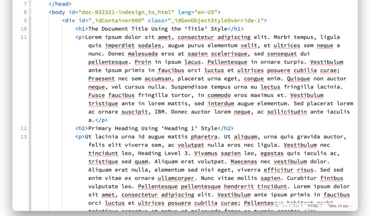
It’s tough to see how semantically correct HTML markup is in a browser window, so I opened the HTML file in Nova, my favorite code editor for the Mac.

The first HTML export in Nova, my favorite code editor for the Mac.

A quick scrub of the markup shows markup mostly without superfluous code, classes or ID’s, specifically:

  • Title style mapped to <h1>
  • Heading 1 mapped to <h2>
  • Heading 2 mapped to <h3>
  • Bolded text (assigned the Strong style) mapped to <strong>
  • Italicized text (assigned the Emphasis style) mapped to <em>

The bulleted lists and numbered lists are messier.

The bulleted and numbered lists have unnecessary classes and no indentation for nested lists.

Fixing the Bulleted and Numbered Lists

Both the bulleted and numbered lists are assigned the “List Paragraph” paragraph style by Word. I did not assign an export mapping to it. After trying a few things that didn’t work in InDesign’s export mapping for the “List Paragraph” style, I returned to my source Word document and did the following:

  1. Assigned the bulleted lists the “List Bullet” paragraph style.
  2. Assigned the numbered lists the “List Number” paragraph style.
  3. For nested lists, I assigned the “List Bullet 2” and “List Bullet 3” styles depending on the level of nesting.

Back in InDesign, I then mapped the List Number, List Bullet, List Bullet 2 and List Bullet 3 paragraph styles by:

  1. Setting the “Tag” to li and unchecked “Include Classes in HTML” in the InDesign export mapping for the List Bullet, List Bullet 2, List Bullet 3 and List Number paragraph styles
  2. In the “Advanced” panel of the “HTML Export Options” screen (when you do File > Export…) I chose Don’t include classes in HTML.

With that, the HTML exported without the unnecessary classes.

Bullet and number lists exported without unnecessary classes.

What Did I Find?

In short, InDesign’s Export to HTML functionality is very robust and produces very clean, semantically correct HTML markup. But it does take some effort to set up the styles correctly to get there.

This underscored the value I found in the Adobe CC Libraries functionality as those carefully constructed paragraph and character styles can be added to a CC Library with every setting intact. This makes it extremely easy to expand this workflow to multiple people without requiring them to completely understand the nuances of HTML markup and the nuances of setting up the styles correctly.

And each time I added complexity to a document and met with success I wanted to push the functionality further and further. To that end, I have three more blog posts planned:

  • Often-used HTML tags
  • Tables
  • Images

Putting It All Together

The Export to HTML functionality requires paragraph and character styles mapped to HTML tags.

To create a repeatable, sustainable workflow, the most important first step is aligning HTML tags to paragraph and character styles and either saving those styles in an InDesign template document or in a CC Library. I prefer the CC Libraries because they are available anywhere and can be shared with others.

Here is a table with the mapping I did in this post:

Style NameStyle TypeHTML Tag
TitleParagraph<h1>
Heading 1Paragraph<h2>
Heading 2Paragraph<h3>
Heading 3Paragraph<h4>
NormalParagraph<p>
StrongCharacter<strong>
EmphasisCharacter<em>
List BulletParagraph<li>
List Bullet 2Paragraph<li>
List Bullet 3Paragraph<li>
List NumberParagraph<li>
Style Mapping to HTML Tags

Most long-form documents have more complexity than just the HTML tags I mapped here, so as I explore this functionality by adding additional complexity I’ll update this table.

Stay tuned for the additional three entries on this topic.

Adobe CC Libraries: Paragraph and Character Styles

A few months ago I wrote a post giving an overview of Adobe CC Libraries. Since that time and after integrating them into my workflow, it’s clear that one of its most powerful features is the ability to store paragraph and character styles.

The ability to create a style once and share it not only with others but also with different Adobe apps is remarkable and an incredible time saver.

Establishing Standard, Baseline Styles

From the moment I started desktop publishing in the mid-1980’s, the standard content creation workflow always seems to start in a word processor. Over time Microsoft Word has become the de facto one, so as I formalized my content creation workflow, I decided to standardize my paragraph and character styles on the default ones from Microsoft Word. That way when I place a Word doc in InDesign the style formatting will be automatically applied.

To see all the styles in one place and to have a better understanding of the depth and breadth of the styles, I created a Word doc listing all the standard Word paragraph and character styles.

A Word doc listing all the standard Microsoft Word paragraph and character styles.

Recently I updated that to include a text example of the style.

A Word doc listing all the standard Microsoft Word paragraph and character styles with examples.

Which Adobe Apps Can Use Styles?

According to Adobe’s Help System these Creative Cloud desktop apps can use styles from CC Libraries:

  • Adobe Illustrator,
  • Adobe InDesign, and
  • Adobe Photoshop (character styles only).

As of this writing, CC Libraries don’t have very robust integration into the Creative Cloud mobile apps. Hopefully over time that will change, including making text styles available in the incredible Photoshop and forthcoming Illustrator apps for iPadOS.

Creating Styles

I decided to create my styles in InDesign (versus Illustrator or Photoshop) because InDesign has the most robust set of options when creating them, so it seemed important to create them with the most options defined as possible.

As a starting point, I created a source InDesign document using the Word doc I had made with all the styles listed and with text examples. That way if a style needed to be changed or a new one added, there was a single “source of truth” to update and then that “source of truth” could be easily used to import the styles into a CC Library.

An InDesign file listing all the standard Microsoft Word paragraph and character styles imported into and defined in InDesign with examples.

Organizing the Styles Library

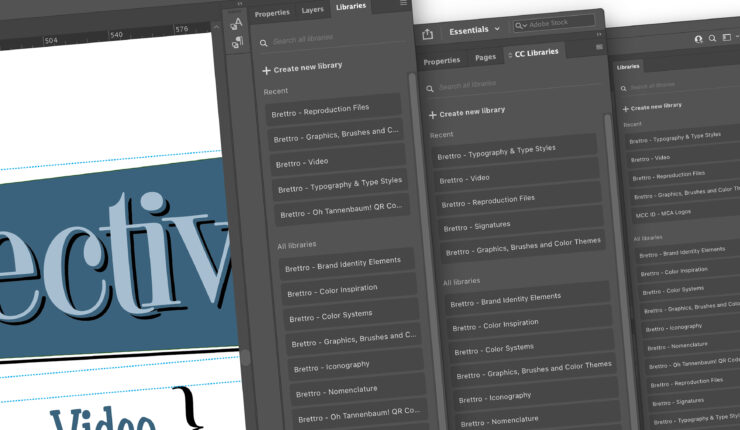
When I initially established my CC Libraries for Brettro, I created one specifically for text styles, appropriately named “Brettro – Typography & Type Styles.” The styles were then organized by group:

  • Paragraph Styles – Front matter: styles for title, subtitle, date, etc.
  • Paragraph Styles – Body matter: styles for headings, body copy, photo captions and credits, etc.
  • Paragraph Styles – Back matter: styles for endnotes, bibliographies, etc.

This seemed like a perfect organization scheme until I realized that many of my styles were different depending on the type of print document I was making. For example, my marketing-focused materials use different titles and headings compared to my long-form documents.

Multiple Type Style Libraries

To minimize confusion, I now have two “source of truth” style documents for InDesign and two CC Libraries for text styles:

  • Brettro – Marketing Material Type Styles: for all type styles necessary to create marketing-style materials like one-to-two page handouts or fact sheets, and
  • Brettro – Presos, Proposals and Pub Type Styles: for all type styles necessary to create long-form documents.

These library names are aligned with how I store and name my documents using a document numbering standard I developed in late 2008.

Type Style Library Groups

I changed the group structure of these libraries to this:

  • Titles & Headings: contains the paragraph styles for the document title, subtitle and the headings
  • Body Copy – Basic: contains the paragraph styles for the body copy paragraph styles
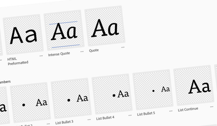
  • Body Copy – Stylized: contains the paragraph styles for the different text elements in the body copy the may need styling, like quotes, captions and photo credits
  • Lists – Bullets and Numbers: contains the paragraph styles for the various levels of bulleted and numbered lists
  • Character Styles: contains the character styles for things like bold and italicized text and hyperlinks
  • Document Formatting: contains the paragraph styles for the document headers and footers

This makes it easier to more quickly find the styles I need when I’m working in specific parts of the document.

Wrapping it Up

So there it is: paragraph and character styles in Adobe CC Libraries. The value of this is incredible because now you don’t need to go hunting through InDesign documents to find a style you once created, you can keep them in a CC Library.

Adobe CC Libraries: What Are They?

In 2015 Adobe released new functionality called the “CC Library” as part of its Adobe Creative Cloud. The intent was to provide a cloud-based repository for quick access to frequently used graphics, color themes, brushes and more across devices. The potential for this was—and remains—incredible. As more and more people, including me, are start working on one device and finishing on another, having this kind of functionality is ideal.

What Can CC Libraries Store?

This is a consistently changing list as Adobe makes the Libraries’ capabilities more and more robust. As of right now, according to Adobe’s Help System, they can store:

  • graphics (like logos and other brand assets),
  • icons,
  • video clips,
  • brushes,
  • character and paragraph styles,
  • layer styles,
  • looks,
  • patterns,
  • 3D objects,
  • video, and
  • color themes

Setting Up Libraries

Adobe’s web-based Help System provides quick and easy explanations for:

  • Creating a library,
  • Adding elements to a library, and
  • Logically grouping those elements within a library.

Brettro’s Libraries

After some fiddling, I settled on the following CC Library structure for Brettro:

Library NameGroupsContent
Brand Identity ElementsBrand name
Tagline
Sub brands
Elements of the brand identity that should be conveniently available
Color SystemsPalette – default (RGB & Hex)
Palette – default (CMYK & PMS)
Palette – supporting (RGB & Hex)
Palette – supporting (CMYK & PMS)
Palette – web (RGB & Hex)
All color palettes for the organization divided into color spaces for digital (RGB and Hex) and print (CMYK and PMS)
Graphics, Brushes and Color Themes Automatically created “My Library” library by Adobe where it stores Adobe Stock images and graphics, color themes and brushes
IconographyDigital (.gif, .jpg & .png)
Print (.ai & .eps)
Icons assigned for a specific purpose that help underscore the overall brand identity.
Nomenclature  
Reproduction Files (??)Covers
Mastheads
Grids, covers and other largely unchanged templates that are frequently used
SignaturesSignature – cmyk
Signature – rgb
Signature – one color
Lock-ups of the organization’s logo with all the elements that comprise its signature.
Typography & Type StylesDigital styles (Photoshop)
Marketing Mat’l Styles (InDesign & Illustrator)
Publication Styles (InDesign & Illustrator)
Type styles to help easily create properly structured graphics, charts and documents.
VideoFront Bumper
Back Bumper
Lower Thirds
Text Animations
Looks
Standard video elements like bumpers and color “looks.”
Brettro CC Libraries Structure

Wishlist

I’ve only just begun to scratch the surface of what’s possible with CC Libraries and Adobe is continuously improving them. I can’t wait to see what features they add next, but two features I would love to see are:

  • Ability to add InDesign and Illustrator template files (.indt and .ait)
  • Ability to add code snippets for Dreamweaver

In both cases this functionality would allow for quick access by multiple people to frequently used document and graphic templates and frequently used code patterns when marking up text.

Diving into Design Systems

It seems like design systems have taken the web world by storm. I feel like everywhere I look there’s a tweet or a blog entry or a conversation about creating or implementing a design system. So I thought I’d dive in and see what this is all about. And in that process, I discovered that this is something I have thought should exist for a long, long time, but I didn’t know what to call it.

After doing a deeper dive into these things, I decided to create a design system for Brettrospective. It might be overkill for a one-man shop, but I learn best by doing, so by creating one I’m learning and earning experience in the process. And it’s fun.

Basic Comprehension

The first thing I do when I want to learn about something is buy a book. Coincidentally, A Book Apart had recently released Expressive Design Systems, which provided a fantastic primer to the overall concept. From there, I read:

I took an in-depth look at Spectrum, Adobe’s design system, to understand its approach, drooled over the visual appeal of Audi’s design system and reveled in the structural elegance of IBM’s Carbon design system. And then I took Demian Borba’s “Creating a Design System with Adobe XD” LinkedIn Learning class.

Getting Started

With a basic understanding of a design system’s structure and contents, I began mapping out the initial structure of the Brettrospective Design System:

  • Color palette;
  • Typography and Text;
  • Iconography; and
  • Components

This isn’t a comprehensive design system structure, but it’s a good start. Over the next few months I’ll be documenting the development of each of these parts here.

Development Tools

As I get started, I’ll be using

  • Microsoft OneNote to jot notes and document decisions; and
  • Adobe XD to create and visualize the details and elements of the system

Check out the My Creative Toolbox entry for a deep dive into the products I use.

Let’s Get Busy

With some good baseline knowledge, great resources and a solid plan, let’s get started! The first thing I’ll be tackling is typography.